Courtenay Healing Centre
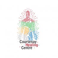
Logo details
Courtenay Healing Centre is an alternative medicine clinic.
The goal of the project was to create a branding platform that positioned Courtenay Healing Centre as a leader in alternative medicine and a trusted resource for information and support.
Four key terms are highlighted with this concept. Integration, Balance, Empowerment and Connection were featured to embody one key direction: The Human Universe.
The human body is a small universe unto itself with a complex system of subsystems of energy and matter which work together to maintain healthy human mind and body. This universe is made of an energy called chi. The ancient Chinese described it as “life-force”. They believed chi permeates everything and links the parts of our surroundings together. The circles represent the flow of energy around and through the body and the human universe with all of it’s subsystems. The colors represent the 5 Elements: metal, water, wood, fire and earth. The larger circles represent the pathway of connection throughout the body. The smaller dots surrounding the human form represent the external factors which effect the human body’s natural processes.
- Uploaded by:
- brandandbridge
- Uploaded on:
- Wed, 11/09/2011 - 18:15
- Vector file:
-
 chc-final.ai
Designer info
- Designer(s):
- Aaron Heppell
- Designer's Company:
- Brand and Bridge Creative Services
- Designer's Website:
- http://www.brandandbridge.ca
Additional images


