DeNure Tours
Logo details
THE COMPANY
Caring Since 1960
DeNure Tours is a family-owned, Canadian motorcoach business, located in Lindsay, Ontario – 90 km northeast of Toronto. Fred and Dorothy DeNure began operating sightseeing tours in 1960 with destinations that included day trips in the Toronto area and longer tours to Atlantic Canada. The business has grown to include further-reaching destinations throughout North America as well as Britain and Europe.
The DeNure family saw an opportunity to bring small-town hospitality and compliment it with their passion for travel. A constant ingredient from day one has been a warm hospitable connection with customers. Now under the leadership of Fred and Dorothy’s son Ray, the DeNure tradition of service and personal warmth continues.
THE BRAND VALUES & CONCEPTS
The company is unique in the motorcoach business focusing exclusively on touring with its own coaches. This ownership of coaches allows better control over the touring elements of transportation, itineraries and staffing, which facilitates a smoother, more carefree and unique holiday.
For over 50 years, DeNure Tours has offered mature travellers the chance to follow their dreams, explore and discover new destinations.
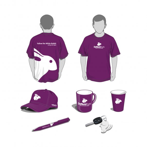
The new brand symbol, a White Rabbit, is reminiscent of the Rabbit character from the story, Alice in Wonderland. Just as Alice followed a White Rabbit and found exciting adventures, so too can DeNure Tours help turn travel dreams into reality. Life is exciting as it is dreamed to be.
The three essential pillars of the DeNure Tours brand are:
Dream Explore Discover
DENURE TOURS VISUAL IDENTITY
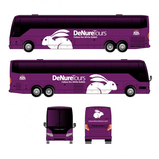
Travelling the magical bus that leads you to dream, explore and discover a world, full of new experiences and adventures. The story Alice in Wonderland offers the perfect semantic connection – the inspiration to follow the White Rabbit to adventure, to magic, to the desired vacation.
The Visual Identity of DeNure Tours is composed of two visual elements: the symbol and the logotype. The integration of these form a unique and solid image with a high degree of memorability. The shape of the rabbit is affable and friendly, standing on its feet in position to leap to inspiring vacaction destinations. The White Rabbit is contained in the form of a semi-circle for contrast and readability.
While having the historical heritage of previous DeNure Tours branding, the colour Purple is the bridge linking the old brand equity to the new Visual Identity. Purple also has the connotation of medieval monarchies and peerage.
The logo consists of two versions of the same typeface to distinguish the words. The typeface, The Sans™ is a humanist sans serif font that is part of a larger family of fonts designed in 1994 by Berlin, Germany–based designer Lucas de Groot. Its simplicity and friendly shape complements the symbolic portion.
- Client's Website:
- http://www.denuretours.com/
- Uploaded by:
- Ross Rodgers
- Uploaded on:
- Thu, 01/10/2013 - 22:24
Designer info
- Designer(s):
- Jarold Muiño Lugo
- Designer's Company:
- RadonicRodgers Strategy+Marketing
- Designer's Website:
- http://www.radonicrodgers.com/
Additional images
