Harajuku Gyoza
Logo details
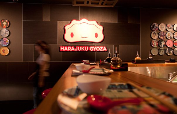
Harajuku Gyoza is a new restaurant recently opened in Brisbane, Australia. The theme is inspired by Japanese gyoza restaurants found in Tokyo and Harajuku street culture. Being a relatively new concept in Brisbane meant the brand needed to be iconic and memorable. We wanted to pull together both the charm and playfulness of Harajuku style and the clean interior design of Japanese gyoza bars and restaurants.
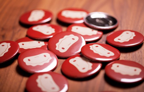
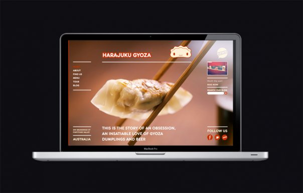
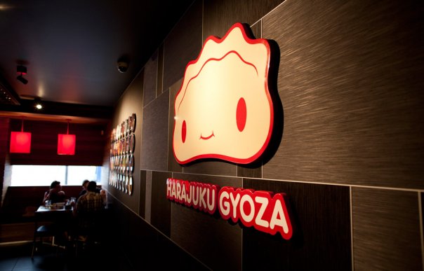
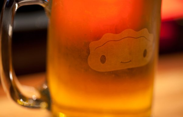
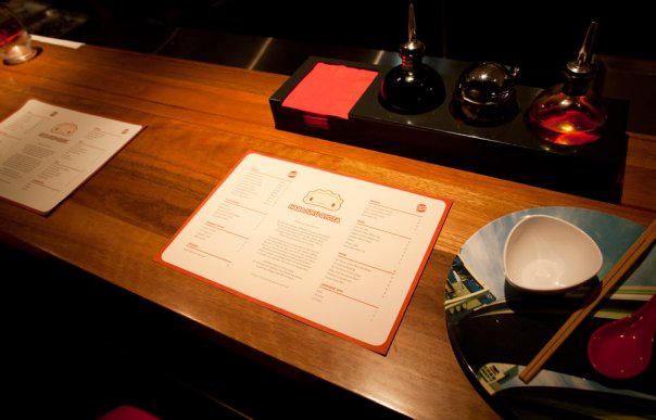
Being a gyoza bar it made sense to develop a logo based on a gyoza-like character that had a very Japanese style and could be used for a number of applications such as signage, packaging, stationery, uniforms, website etc. In contrast to the character the rest of the brand was kept very minimal, mainly using a gum wood texture and black slate for the design of the restaurant.
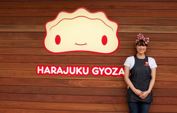
As a result the logo stands as a point of focus for the restaurant both on the exterior and interior and has become a talking point for the brand.
- Client's Website:
- http://www.harajukugyoza.com
- Uploaded by:
- Alan Crowne
- Uploaded on:
- Sat, 12/31/2011 - 03:45
- Vector file:
-
 hg_mainlogo_spot.eps
Designer info

- Designer(s):
- Alan Crowne
- Designer's Company:
- alancrowne.com
- Designer's Website:
- http://www.alancrowne.com
Additional images
