ISEM srl
Logo details
In the year 2011, ISEM, italian leader company specialized in luxury packaging for high perfumery business and cosmetics, decided to follow a new course of action, repositioning itself on the national and international market with new purposes and a new image that was able to push the company into new important goals.
Doing packaging and doing it well, with care for details, shapes, production quality. For ISEM, the luxury market has always represented the primary production field. Here began the necessity of finding an appropriate corporate image able to follow the company's ambitions.
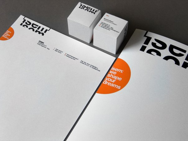
The corporate image needed to reflect ISEM spirit. It had to be conceptually creative, with a neat and organized layout and, with a strong sign, able to give a memorable and highly distinctive message of progress.
And so the logo becomes package, with the name of the company in the product it realized. The color becomes a distinctive element, with the orange highlighting a solid and organized structure, interacting with a fine and studied lettering.
Packaging: big, small, complex, plain. In order to say everything, an icon system was created, based on the graphicsl simplification of several boxes, with a pleasant game of patterns alterned with the rigorous composition of the new trademark/logo of ISEM.
A system in constant evolution, able to lead the company and blend with it to launch the new path outlined by ISEM.
- Client's Website:
- http://www.isemgroup.it
- Uploaded by:
- mattia castiglioni
- Uploaded on:
- Thu, 06/30/2011 - 11:58
- Vector file:
-
 isem_logotype.eps
Designer info

- Designer(s):
- Mattia Castiglioni
- Designer's Company:
- mcastiglionidesign
- Designer's Website:
- http://mcastiglionidesign.prosite.com/
Additional images


