Jae Murphy, Photographer
Logo details
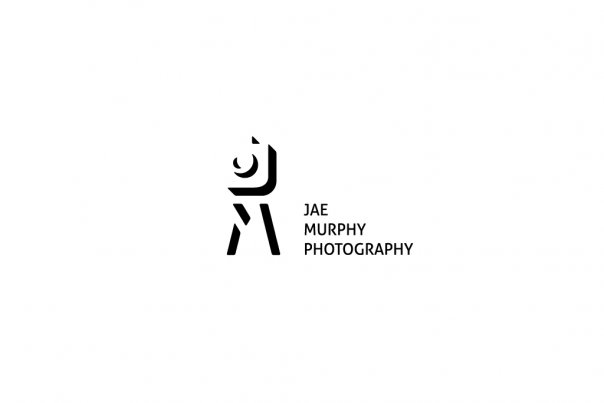
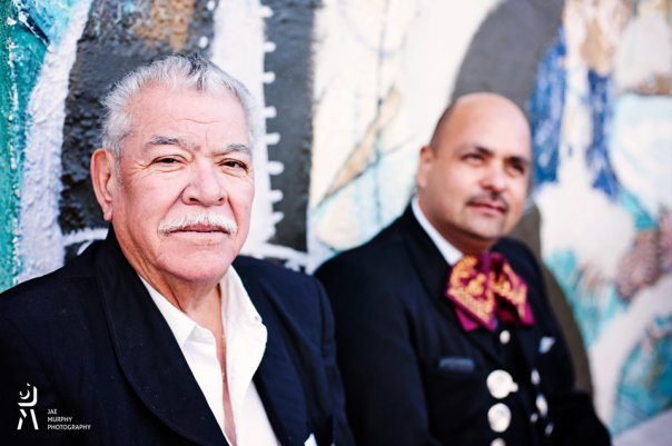
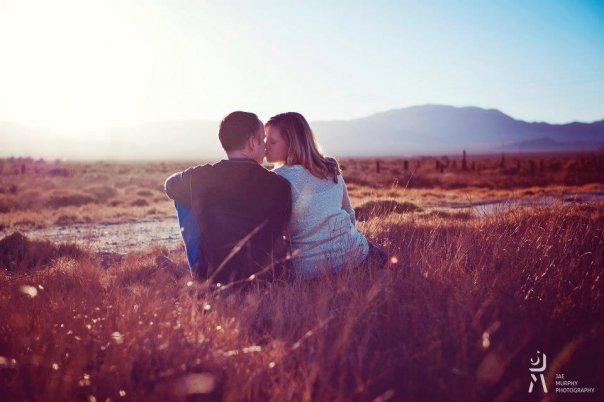
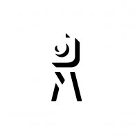
Jae Murphy specializes in portrait photography. Through her distinctive style she creates extraordinary photographs from moments of everyday life. She wanted a simple, powerful and creative logo that will properly reflect the uniqueness of her photos. The use of negative space was highlighted as her favorite solution in the logo design.
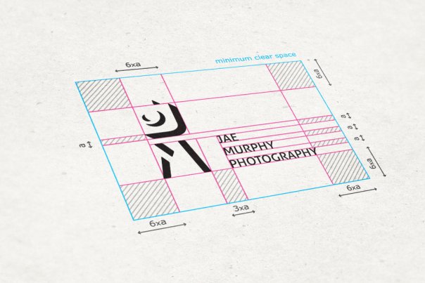
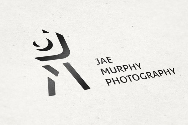
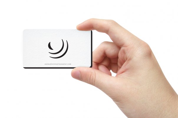
Logo mark has initials J, M, the camera and tripod incorporated in the negative space. The name (Jae Murphy Photography) was formed in three steps on which the photographer needs to climb in order to take a shot. By this it's achieved that logo acts as one scene. Since Jae Murphy often photographs children, the big stairs and low placed camera suggest that kids are welcome.
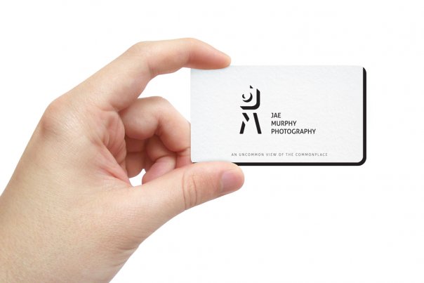
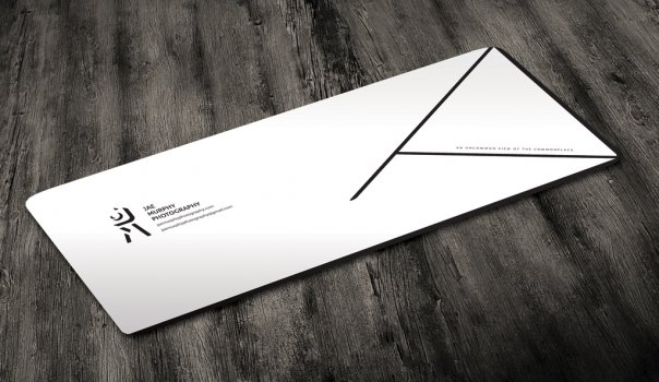
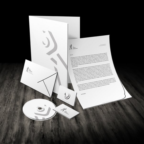
Through Corporate Identity design I developed the negative space idea from the logo. It adds a new dimension to every item and makes the slogan - An Uncommon View of the Commonplace - stand true.
- Client's Website:
- https://www.facebook.com/JaeMurphyPhotography
- Uploaded by:
- balic
- Uploaded on:
- Thu, 12/27/2012 - 11:48
Additional images
