JKL
Logo details
JKL is a web video production company. JKL develops a new video format targeting specifically websites and social networks. I was commissioned to design their logo. They wanted something modern, dynamic and clean, expressing creativity, reliability and quality.
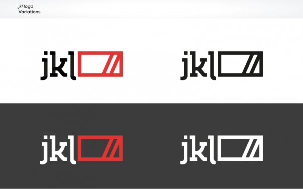
The logo consists of the typography and the symbol. The symbol is multipurpose. It can be used with or without the type. The primary logo colors are red and black, reflecting the quality, reliability and creativity of the people of JKL. But in the same time, it can be aliv e and vibrant, changing colors depending on the use. It is easy to read and recognize even in small sizes and shows great on screen.
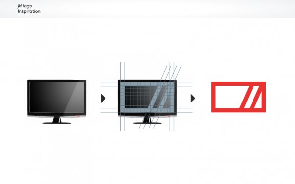
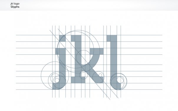
The symbol is a widescreen monitor with a highlight on the screen. It is designed as a widescreen 16:9 format. The jkl glyphs are designed specificly for the purposes of this logo. The slab serifs strengthen the image while the delicate details of the k represent the quality. The simple lines are modern and dynamic.
- Uploaded by:
- kosbarts
- Uploaded on:
- Mon, 11/19/2012 - 00:31
- Vector file:
-
 jkl_print_cmyk.pdf
Designer info

- Designer(s):
- Kostas Bartsokas
- Designer's Company:
- Intelligentdesign
- Designer's Website:
- http://www.intelligentdesign.gr
Additional images


