Langan's
Logo details
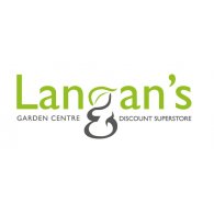
The client required a logo that communicated to the audience that it was both a Garden Centre and Discount Superstore.
This was achieved by introducing and pronouncing an ampersand, then combining a leaf to form the letter 'g' in 'Langan's'. The customers attention are drawn to the '&', therefore making the relevant connection.
SUMMARY
Langan’s motif is a combination of two symbols; the letter ‘g’ and an ampersand. This motif reinforces the two sections in Langans and gives strenght to the brand.
- Uploaded by:
- AngieM
- Uploaded on:
- Tue, 11/13/2012 - 21:45
Designer info
- Designer(s):
- Angela Mahon
- Designer's Company:
- Brand strategy & Design ltd T/A Designhub
- Designer's Website:
- http://www.designhub.ie

