OMCA - Ontario Motor Coach Association
Logo details
THE ASSOCIATION
OMCA is one of the largest travel and tourism-related associations in Canada, and the voice of private sector bus operators, inter-city bus lines, charter and coach tour companies.
Motor coach travel and tourism generates hundreds of millions of dollars per year in economic activity, making it one of the most important sectors in the tourism industry in North America.
OMCA has over 1100 members and represents more than 75 bus operators, over 100 tour operators, 62 bus product & services, and some 800 affiliated sellers to the group tour industry including attractions, destinations, hoteliers and retail outlets across North America.
THE BRAND VALUES & CONCEPTS
OMCA is an organization that provides high value opportunities for its members to grow their business. OMCA is a strong, inclusive network of interdependent businesses producing results greater than the sum of their individual parts. OMCA is an organization that cares deeply about providing the highest level of value and personal service for its members. It is the heart of OMCA that embraces the road to sustainable and progressive development of the industry by providing advocacy and education with the aid of technology to members across North America.
The four essential pillars of the OMCA Brand Values are:
Opportunity Mutual Care Advice
THE BRAND IDENTITY
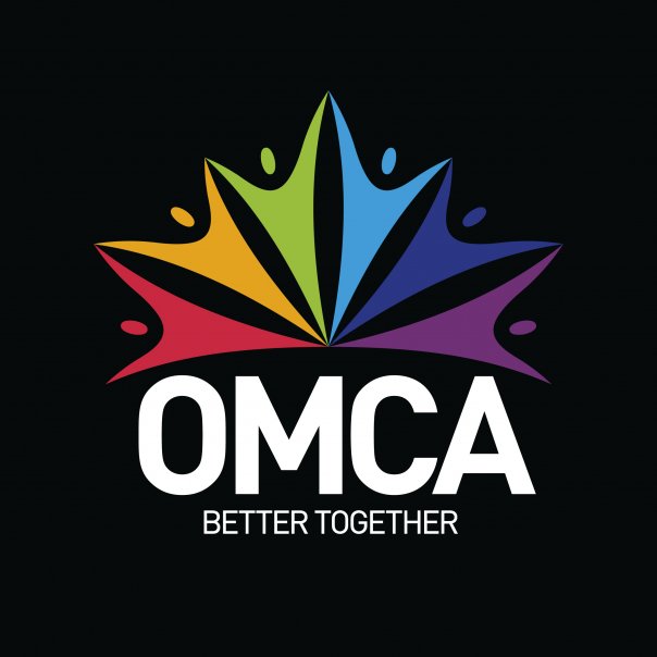
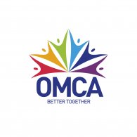
OMCA’s Brand Identity is composed of two elements: the symbol and the logotype. The human figure with open arms is the core element that makes up the symbol of the OMCA brand. This human figure represents the essence of an “association” where inclusive partnerships exponentially accelerate business goals for members.
The human figure element is rotated so that the six figures touch, symbolizing member collaboration. Different primary colors for each of these elements display the geographic and business-type diversity in the membership of this association. The resulting composition secondarily represents the Canadian maple leaf.
The typeface, DIN Pro, presents a solid foundation in the logotype. This typeface was designed by Albert-Jan Pool in 1995. Modern and clean with a high degree of legibility, its simplicity complements the symbolic portion, forming a solid and compact unit. The colour scheme of the identity utilizes a “spectrum” of colours including: warm red, orange, light blue, dark blue, and violet to convey togetherness, modernity and transparency.
- Client's Website:
- http://www.omca.com
- Uploaded by:
- Ross Rodgers
- Uploaded on:
- Thu, 01/10/2013 - 17:56
Designer info
- Designer(s):
- Jarold Muiño Lugo
- Designer's Company:
- RadonicRodgers Strategy+Marketing
- Designer's Website:
- http://www.radonicrodgers.com
Additional images
