The Food Store
Logo details
‘The Food Store’ comprises of two retail shops selling and distributing a range of it’s own products (over 200 produced daily) in it’s butchery, bakery, deli plus a range of niche products and organic goods. 'The Food Stores' produce in all sections are home made, of high-end quality and are made using the finest local ingredients. Because The Food Store want the meat counter in both shops to grow to 50% of turnover, it has become necessary to refresh the brand identity to reflect the following values:
Quality-Value- Artisan-Homemade-Unique - Recognisable
HIDDEN SYMBOL
The hidden and subtle symbol in the logo depicts a butchers knife.This helps aid the reinforcement of the butchery section in ‘The Food Store’. The unique characters and design of the logo lends itself to be trademarked.
The three dots represent the three sections in The Food Store (Butchery, Bakery & Deli).The dots are also important in their usage for recognising the butchers knife clearly.
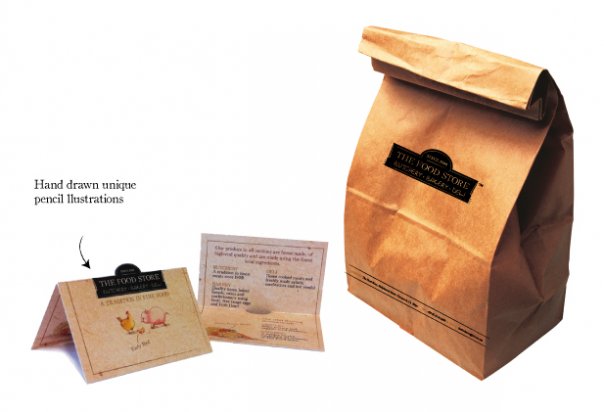
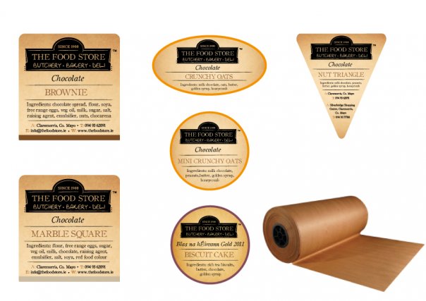
Materials used: Kraft paper, brown recycled paper, cardboard and butcher paper
Unique illustrations were drawn up to compliment the brand. These illustrations will be used throughout the interior of the shop. The three illustrations represents the three sectors within 'The Food Store'
- Uploaded by:
- Angela Mahon
- Uploaded on:
- Fri, 12/23/2011 - 13:05
- Vector file:
-
 final_foodstore_logo.pdf
Designer info

- Designer(s):
- Angela Mahon
- Designer's Company:
- Midlands Brand Strategy & Design Ltd T/A Designhub
- Designer's Website:
- http://www.designhub.ie
Additional images


