Tonnelle Wine & Liquors
Logo details
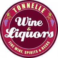
This customer and good friend wanted to change the look of his business, more attractive, compact, and dynamic with new colors.
That is the reason I chose the circle to enclose the logo and the colors to make a focus on Wines.
He was looking for a script letters but bolder at the same time. Then I chose this font because have a nice curves, easy to read and is bold.
He loved his new logo an immediately put it in the new web page and advertising.
After that we did all the new signs on his business.
- Client's Website:
- http://www.tonnelleliquors.com
- Uploaded by:
- MikeArt
- Uploaded on:
- Tue, 07/17/2012 - 15:19
Designer info
- Designer(s):
- Miguel Puga
- Designer's Company:
- Cad Signs
Additional images


