Upper Canada Lines (shipping)
Logo details
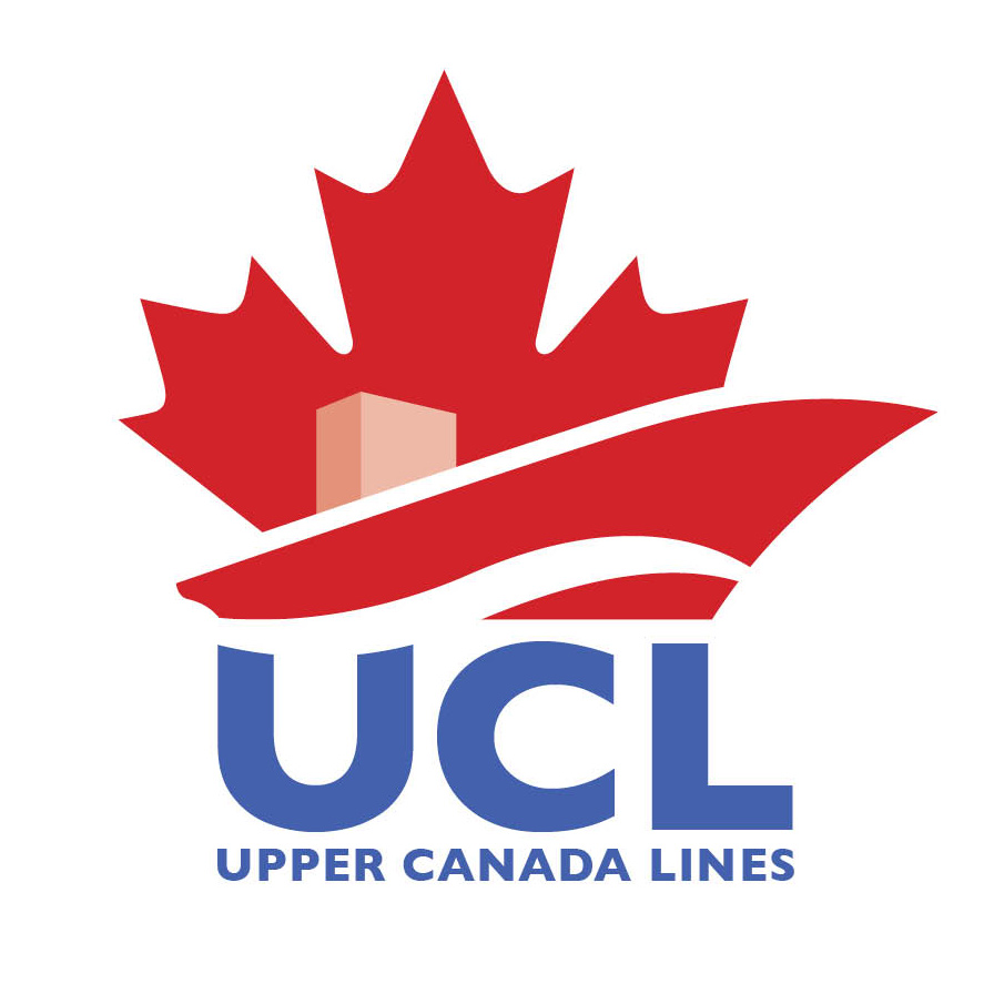
The client wanted an image that conveyed upward, forward movement and that it was a Canadian Company. It had to be visible and noticeable from a long distance on the side of a ship or a flag.
The points of the leaf at the bottom right were exaggerated and extended up and out to the right to create the ship's bow and the stern of the ship was created from the lower left point of the leaf with the ship's bridge completing the image of a ship as a stylization of bottom portion of the leaf.
An added feeling of movement, which tied in with the shape of a leaf, was created by the white wavy ship's wake coming up on the bow at the waters edge.
Unfortunately, after submitting many rounds of designs, in which many different ideas were considered and this one being chosen as their final logo, the entire plans for this startup company were scrapped, leaving this logo for a Canadian Shipping Company available for use. The name can be changed to anything since no part of it was used in the logo.
- Uploaded by:
- scottpetrie
- Uploaded on:
- Fri, 07/20/2012 - 17:38
Designer info
- Designer(s):
- Scott Petrie
- Designer's Company:
- Bullseye ink Communications & Design
- Designer's Website:
- http://www.scottpetrie.ca