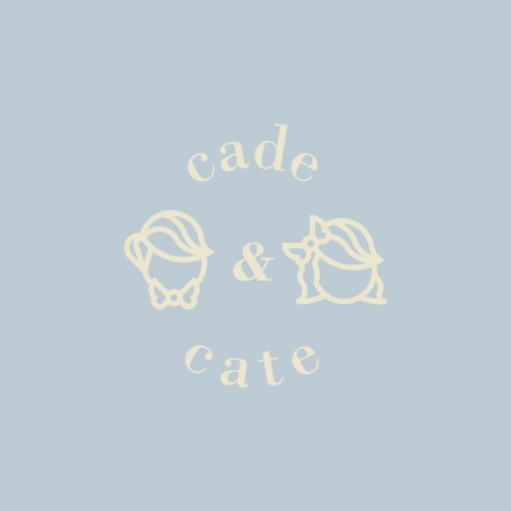
Cade&Cate
Brief from client
A vintage logo but with a whimsical feel as well as an elegant font included.
The main icon should have a depiction of a boy and a girl and maybe a hot air balloon. Soft pastel colors should be used.
This is for my side business that I do for fun. Selling ribbon made hair bows and bow ties and hopefully expanding to children's clothing in the near future.

So I decided to work on the form first before exploring too much on the pastel colors.
There were a couple versions I did with a hot air balloon but I decided to do away with that since the size difference was too much (between the children and balloon I mean). This route is way different than the previous rounds that I showed to the client.
I think this could really expand to an identity system with patterns of the bow tie, hair bow, and ampersand used throughout. Or a strict wordmark logo ("cade&cate" no spaces in between same font style). Or a simpler version of just the depiction of the icons with the ampersand in between.
I figured at some point if they get into embroidering, thick-lined icons would be best if it gets to that point. So far the icon will mainly be used on screen since she sells the items on Etsy.
To give a friendly/elegant feel I went with an all lower capped serif font (Bodoni MT bold).


3 Comments
Right off the bat, light yellow on light blue makes the logo really uneasy too look at.
Besides that, it's off to a good start. I don't find that that font work really well with the style of the two kids heads. Also, have you tried to give them some fashion of a face? I for one find them a tiny bit creepy :)
Thanks, I realized once I saw the thumbnail I should've added more contrast *facepalms*
I was thinking to have no facial features will help have more emphasis on the bow tie and hairbow to help people envision their own well-groomed kids wearing the accessories. Kind of how mannequins that have no heads while wearing the clothing.
I will try to add some eyes, nose and a big smile. To explore that option.
And maybe a different font, perhaps a sans serif?
I've been struggling with this logo for some time now. Here is another option that I have not yet shown them.
I prefer your first idea.
Like the first comment said, this is just a color and a font issue. As for the faces, if you wanted to add expressions, I would keep them very minimal. Aka, tiny round dots for eyes, something cute, like the attached photo. (I know its a rabbit, but I liked how they did the face with very little effort).
This second idea doesn't make any sense to me. Its just a lightbulb, with a basic font, and a gradient.
The first one at least screams that its a niche Etsy like store, and I was able to tell right off the bat that it was for kids.