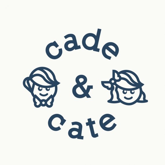
Cade&Cate
Brief from client
A vintage logo but with a whimsical feel as well as an elegant font included.
The main icon should have a depiction of a boy and a girl and maybe a hot air balloon. Soft pastel colors should be used.
This is for my side business that I do for fun. Selling ribbon made hair bows and bow ties and hopefully expanding to children's clothing in the near future.

These won't be the final colors, I'd like the client to focus on shape and form. I went with a slab serif font this time. Just have to find what would compliment it best when it comes to a secondary font.
I have a trail of variations kind of how Aaron Draplin gets to his ideas for logos. Might try to present this one the same way he does.
The last advice I got for this was great! I'd appreciate some more since this logo has been dragging out way longer than I've ever had a logo go on for.


5 Comments
I think you have a really strong idea here, but the balance is a bit whonky. If you look at the guidelines I placed over it you'll see what I mean. This doesn't imply that everything has to be absolutely symmetrical, but visual balance is important. I like the font choice, it could use some kerning adjustment. And if I may make a suggestion, when illustrating children keep in mind they have larger foreheads and smaller chins than adults. I added a simple drawing to show how the lower face features can up the cuteness.
fredrg, you are the man! Thank you for taking your time to give me this insight and the examples you added. I'll add some of the tweaks you have suggested, thanks again.
Fred totally is the man. I think you are really close, but I think the eyes need a style change. Personally, I find the white pupils/black eyes a tad creepy. We want to definitely avoid this with kids faces. Simplify the eyes! if you want to keep the pupils, I would consider making them a tad smaller
why, whatever do you mean?
I like this design, though Fred is correct. It seems out of proportion and weighted to the right.