Quick Design
nicksharp | Thu, 11/10/2011 - 03:59
Brief from client
This was a brief from an architect wanting a logo for a division of his business called "Quickdesign".
He wanted the logo to be available in these colours, and to somehow reflect the architectural nature of his business.
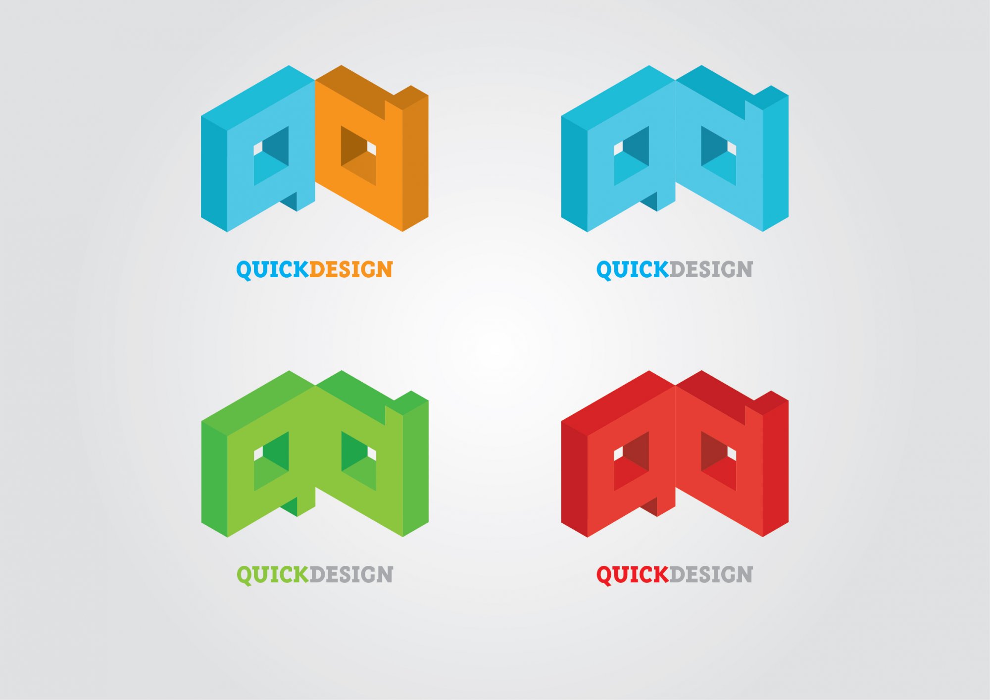
Logo was done on an isometric grid, with the realisation that the letters q and d share a lot of geometric similarities, and could probably make a cool looking logo with a architectural flavour.
Would love to hear what you guys have to say.
5 Comments
I liked first (2 colours) logo.
Try to play with the same color pallet, like green and dark green!
I know client wanted these colors, but they really do not work. Especially not together as a family.
Execution is professional, typography is good, clients color choice is questionable but acceptable but... in my opinion graphic mark 'q&d' is too heavy. When looking at it I just can't shake off a feeling I am looking at a small prison cell. Maybe a different perspective and composition would help shake this off.
Thanks for the comments so far guys, loving the creative feedback.
I agree, the logo colours as a family are very unharmonious but unfortunately thats what I had to work with..
Will upload some more stuff when I get the chance.