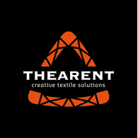
THEARENT
Logo details
Briefing: create a new logo that visualizes our mission:
a) Be the best in the field
b) Attention
- attention to the customer
- attention to the the product
- attention to each other (personal / internal)
- attention at each detail in the process
- attention for mother nature
c) Alway move forward, looking for new opportunities, materials,
production methods
- Usage of the type font Copperplate (old font, for recognition)
- Usage of the color orange (connection with sister company Wentex)
- Usage of the color black (the color of dark venues worldwide where shows mostly are held where THEARENT is supplying textile.
DESIGN
Metafore used is the diamond.
The diamond -just like THEARENT- stands for:
• value
• natural product (stone / textile)
• added value / more beautiful by modifying
• makes beautiful things more beautiful ( show / ring )
• Diamond is a metafore for 'the best' (what THEARENT is willing to be)
There are app. 10 ways of cutting a diamond.
One of the is the Trillion cut, a triangle form.
A triangle is the sign of fertile. THEARENT wants to have a fertile relationship with its customers.
This cutting way is used in the logo of THEARENT.
This cutting way shows several small triangles forming one big triangle.
A triangle is the most strong connection in the building industry, architecture etc.. THEARENT is / wants to be a strong organization build by strong employees.
By pointing the triangle upwards it show the goal of THEARENT: alway trying to reach the top.
- Client's Website:
- http://www.thearent.com
- Uploaded by:
- Joost Bollaart
- Uploaded on:
- Thu, 06/28/2012 - 21:08
- Vector file:
-
 thear_logo.ai
Designer info
- Designer(s):
- Joost Bollaart
- Designer's Company:
- design company Bollaart
- Designer's Website:
- http://www.facebook.com/ontwerpstudiobollaart

