tr
Logo details
objective
Personal marketing strategy through the development of my identity.
concept
PLAN BEE IA bee emerged as a metaphor and as a link to a plan B, graphic design. A goal that I set and I decided to explore.
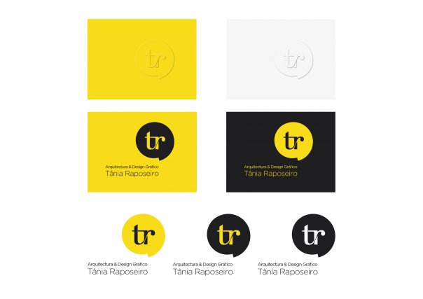
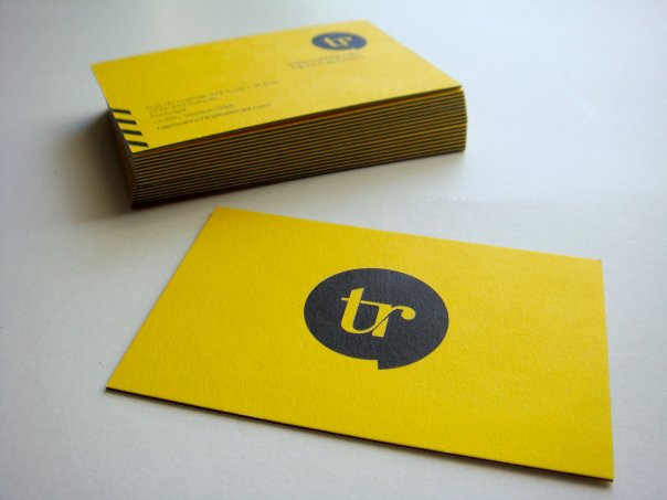
This was followed by the development of the logo using the colors yellow and black, which translate values with which I identify and seek to apply, and typography Kursivschrift, elegant, a mix of serif and script, rational but also organic, revealing my analytical side but also creative and experimentalist. The logo was even inspired and designed to be a monogram, which acts as a quality label, giving authenticity.
- Client's Website:
- http://be.net/taniaraposeiro
- Uploaded by:
- taniaraposeiro
- Uploaded on:
- Tue, 11/13/2012 - 13:38
Designer info

- Designer(s):
- Tânia Raposeiro
- Designer's Company:
- tr I Tânia Raposeiro I Arquitectura e Design Gráfico
- Designer's Website:
- http://be.net/taniaraposeiro
Additional images


