Faroe Islands
Logo details
This design was the result of an internal brand creation task here at http://www.bearfootgraphics.co.uk/ , to be used as promotional material to target the Travel and Tourism industry.
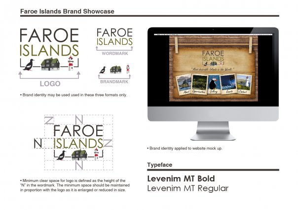
The brief was to create a new brand identity for the Faroe Islands that could be used across any of the country's promotional or marketing material. It was highly important that the logo was reflective of the personality of the islands, and equally important that it had clear readability and communicated effectively in an attractive and appealing manner.
The resultant logo design is a combination of the country's history coupled with their desire to appeal to a broad market. The design is reflective of the heritage and authenticity of the Faroe Islands through the illustration subjects, yet this is combined with a contemporary typeface in order to create an identity that communicates the appropriate message to the intended audience.
The colour scheme used is reflective of the Faroese landscape, with the three illustrations highlighting iconic features of life on the islands; the national bird, the traditional Faroese grass roofed dwelling, and a lighthouse; a common feature along the coastlines and a representation of their primary industry of fishing.
- Uploaded by:
- Sophie Marsh
- Uploaded on:
- Fri, 11/23/2012 - 12:06
- Vector file:
-
 faroe_islands_logo.ai
Designer info
- Designer(s):
- Sophie Marsh
- Designer's Company:
- Bearfoot Graphics
- Designer's Website:
- http://www.bearfootgraphics.co.uk/
Additional images


