DisclosureNet
Logo details
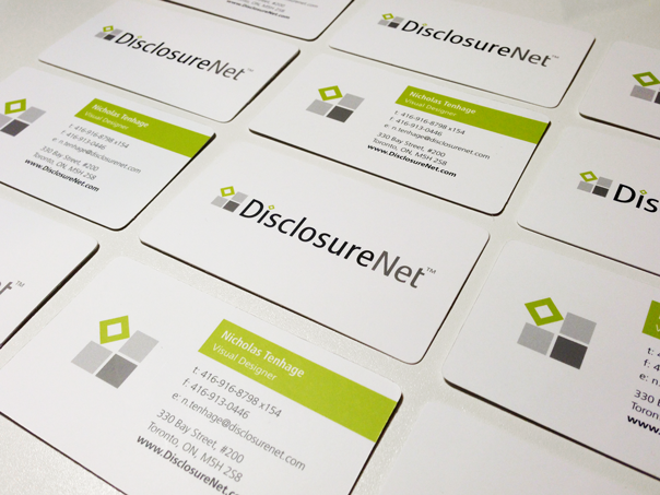
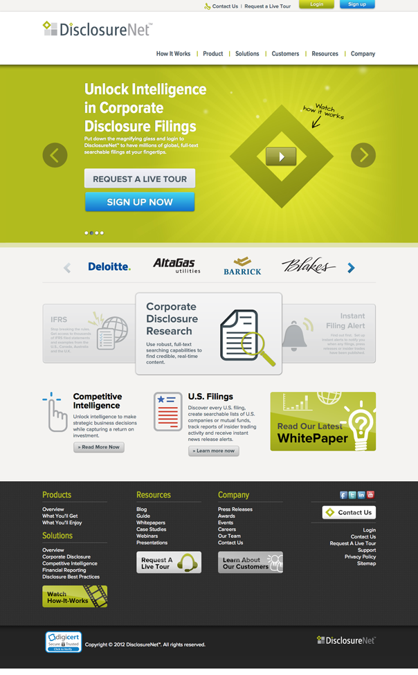
This logo was designed as part of a software company's branding refresh.
The company’s existing clients were happy with the old logo (which used the company name beside a 4-colour box), so the idea was to refresh the logo without completely changing it and overwhelming the clients who were already satisfied with the branding.
The design and colours were updated to produce a unique logo with a clean, modern look. The box turned on its side to make a diamond symbolizes the company’s commitment to innovation and thinking outside the box.
- Client's Website:
- http://new.disclosurenet.com/
- Uploaded by:
- Lauren_TH
- Uploaded on:
- Thu, 12/06/2012 - 18:36
Designer info
- Designer(s):
- Veronica Han
- Designer's Company:
- DisclosureNet
- Designer's Website:
- http://cargocollective.com/veronicahan
Additional images


