Tour Bureau Moscow
Logo details
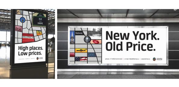
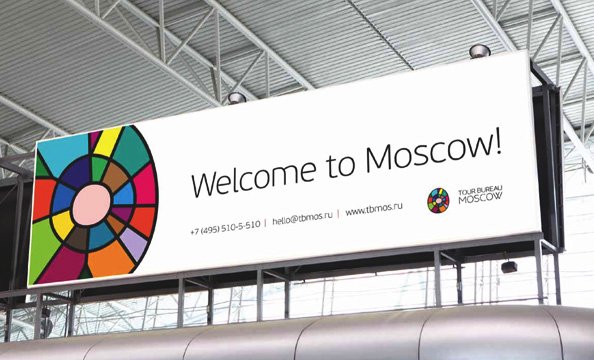
TOUR BUREAU MOSCOW was found in 1988. Moscow has a shape of an oval and it is crossed all over with the streets turning it into a patchwork.Hence the idea of the logo.
The patchwork can perform independently conveying an idea of co-existance of very different cultures within a huge oval of the Moscow Road Ring.
- Client's Website:
- http://tbmos.ru
- Uploaded by:
- Sergey Malaykin
- Uploaded on:
- Fri, 12/21/2012 - 17:18
- Vector file:
-
 tourbureau_moscow_logo.eps
Designer info
- Designer(s):
- Maria Zaikina
- Designer's Company:
- Sky CG
- Designer's Website:
- http://skycg.ru
Additional images


