Copper Run
Logo details
THE COMPANY
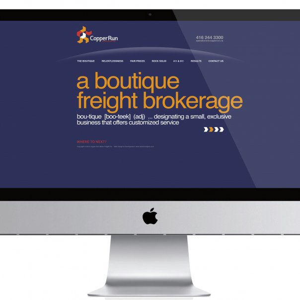
Copper Run is a family owned and operated logistics company arranging truck delivery to destinations across North America. While offering competitive prices, Copper Run utilizes high-tech tools to the highest industry standards.
Copper Run offers personalized service to every client. When clients interact with Copper Run the company makes its clients feel like they are a part of the family.
THE BRAND IDENTITY VALUES & CONCEPTS
Copper Run is a company that offers a personalized, warm and human service. Because of this attention to personal service, Copper Run is a growing company, professional and modern, knowledgeable about obtaining the smoothest, most expedient conveyance of goods.
Competitive and efficient with a high knowledge of the technological and administrative tools necessary, Copper Run provides superior service as a premium shipment provider.
The three essential pillars of the Copper Run identity are:
Human Motion Trust
THE VISUAL IDENTITY
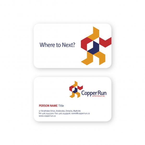
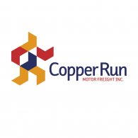
Copper Run’s brand is built with a primary graphic element — the chevron. This symbol connotes dynamism, direction, movement and accuracy. Six chevrons are spatially distributed to form a human figure, reminiscent of the ancient Greek Olympic runners. The negative space of this symbol will add a sense of movement and the shape of a “package” under the right arm.
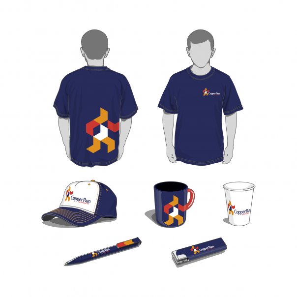
FaceplateSans is the font used in this brand, designed by Rodrigo Xavier Cavazos - 2001. Modern and clean with a high degree of legibility, its design complements the symbol, forming a solid and compact unit. This identity uses three warm colors with a high degree of saturation: orangy red, warm yellow and dark blue to convey friendliness, modernity and transparency.
- Client's Website:
- http://www.copperrun.ca
- Uploaded by:
- Ross Rodgers
- Uploaded on:
- Thu, 01/10/2013 - 19:56
Designer info
- Designer(s):
- Jarold Muiño Lugo
- Designer's Company:
- RadonicRodgers Strategy+Marketing
- Designer's Website:
- http://www.radonicrodgers.com
Additional images
