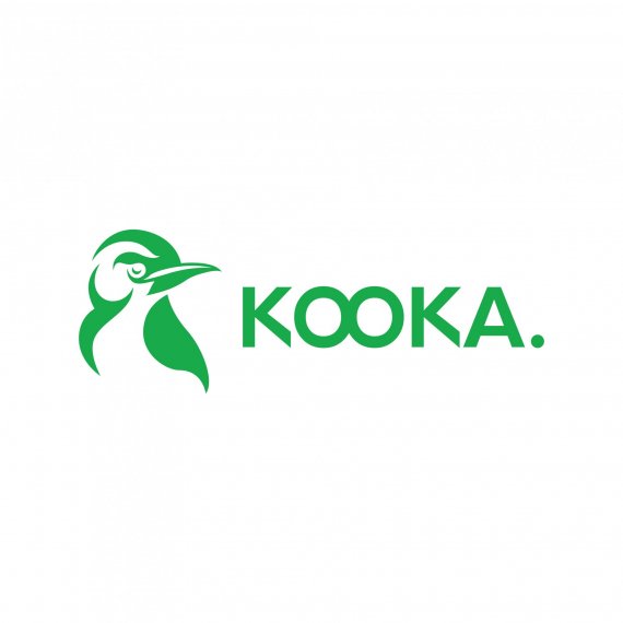
KOOKA
EdgarSacadura | Wed, 12/12/2018 - 18:21
Brief from client
Here i am, again... with another logo :D
This time its for "Kooka." a bird observatory in a protected area.
Kooka comes from Kookaburra a specific bird native of Australia.
Requirement:
- one color (green or blue)
- the dot in the end of "kooka"
- Modern "straight" look

The idea is to keep it simple and clean.
The icon is a minimalistic drawing i´ve made of a kookaburra.
In sketches i´ve made a lot of "straight line" designs but it was killing the feeling of nature, so i decided to go with more natural-curved lines...
In contrast i used a more straight typography, to go with the client taste... Although is a bit mainstream the two O´s form binoculars, but i really think the way its made its so simple and non-destructive that it may work.
BYE!


2 Comments
Alternative version
This is a pretty good start!
One thing I really like, is the two O stuck together, subtly figuring out binoculars, send back to the whole observatory thing. Very clever.
That being said, I think the symbol can use more work, especially the beak. I've just had a look at a picture of kookaburra and they have a very specific beak that I don't really see in your symbol.
Keep up the good work!