Personal Brand Logo
Brief from client
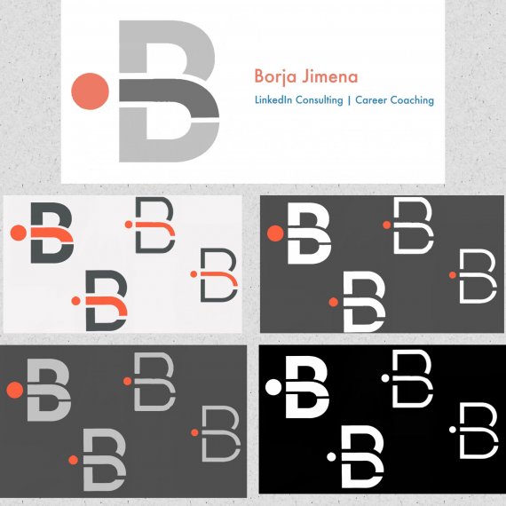
I wanted to design a monogram logo made of my two initials (B & J) to incorporate to my presentations, website, social media, etc.

Can you give me some professional advice on my personal brand logo?
As an undergraduate with a side hustle, I cannot afford expensive branding services, so I decided to spend some time researching branding guidelines, the psychology of color, etc. and after many weeks of hard work and hundreds of mockups I have came up with this design.
However, I’m not sure of the size of the logo, the colors and the typography either, and would love to know your opinion regarding the proposed logos and any modifications.
I have attached 4 different logo ideas with different color combinations and a combination where you can also see the colors I’d like to use for my name and the subtitle.
Some facts about my brand:
1. WHO I AM: a young professional (22 years old) passionate about learning, meeting new people and helping them grow in their careers. I’m interested in tech, communication and talent management, so I have a strong focus on people.
2. MY BUSINESS: just started a personal branding and LinkedIn consulting business (to design personal branding strategies on LinkedIn). I’m also writing a book centered around personal branding in the digital age.
3. TARGET: professionals and CEOs looking for a strong digital presence with career/business growth goals.
4. THE LOGO:
4.1. BRAND ATTRIBUTES: I would like the logo to reflect professionalism, trust, but also to be fresh and dynamic. So I want something clean and sophisticated, with a modern feel, which isn’t too serious (I’m 22, professional enough to work with senior-level clients but also young and creative).
4.2. COLOR PALETTE: I’ve thought of dark, vibrant BLUE, dark GREY/BLACK, ORANGE (not sure of which tone, because I’ve read that it is avoided for luxury, traditional or serious brands). I want to use all that colors in my social media, my website, my presentations...
4.3. FORM SHAPE: initially I thought of something straight edged shapes and straight lines rather than round shapes, but don’t have a clear idea.
4.4. TYPOGRAPHY: I need to choose a topography both for the name and the subtitle, as well as for the website). I’ve been recommended to use Lato, and I’ve also thought of more modern fonts (Montserrat, Roboto, Raleway, Exo, Open Sans, Titilium, Ubuntu...).
P.S. If you need help with your LinkedIn profile and would like to further help me with the logo in exchange for some LinkedIn advice / a premium consulting service of LinkedIn I’ll be more than happy to e-meet you!


3 Comments
It looks good, but i only has reference to your name, not to your (type of) business.
I would not make the j a separate color. The logo is represented nicely in black and white. When posting just post or two variations of the logo
A beautiful, simple and clean logo.