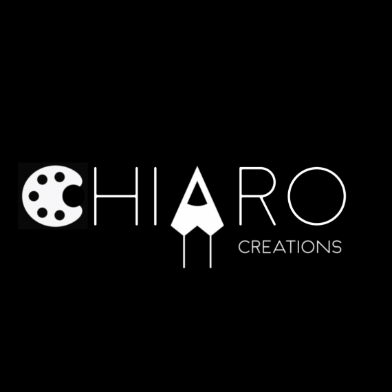
Art / Graphic Design Studio Business Logo
Brief from client
Strong Logo
Convey the art service and business name / meaning
Simple, a logo that can work on multiple devices
Professional look and feel
Primarily the business right now is an art studio that sells personal artwork but later it would expand to display graphic design so logo should be generic enough to allow this expansion
The logo should be brandable and unique

Strong / Professional / Simple
I choose black and white to get across these characteristics. I think black and white is simple, eye catching and modern. Also I chose black and white to convey the business name, chiaro coming from the Italian for light/ vibrant / clear but chiaroscuro of contrasting black and white colours.
I incorporated a pencil as negative space also representing the letter 'A'
Also incorporated a palette for the starting letter to push home the brand and services offered
Palette and Pencil can still be expanded to take into account design services in the future.


2 Comments
In my opinion, the pencil idea has been over done. In this particular case, it looks more like an airplane than a pencil and it is out of balance with Chiaro and Creations. I am also not a fan of symbols in the name, much less two symbols.This would be stronger just in logo type than with the two symbols.
I agree with cooperads, the symbols are a bit overkill. Maybe reduce it to just one symbol, if you must use one at all. I like the font a lot but the C and A are distracting. Simplify!