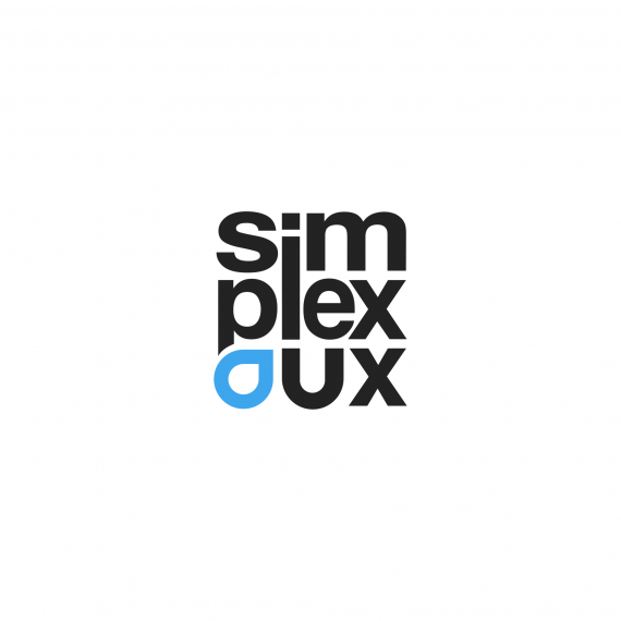
Simplex UX
Brief from client
We are a web design agency. The word simplex is combination of simple and complex. Which mean we analyse the complex offering of a business and simplify it for the end users for better conversion.
Can you combine the concept of simplicity and complexity in the same logo. Keep it very simple and something different than traditional or corporate logo so it look like a logo of a design agency.

I choose the box size logo for more compact and different feeling and embedding the symbol inside the wordmark.
I choose water droplet to combine simple and complex as water can take form of both complex and simple form
But I am having trouble with the weight and balance of each letters. Like the letter m and u look too big and e and s too small. I had to make s small to align i and l vertically.
If you zoom out, the imbalance in the letter gets more pronounced. How can I solve this problem.

