Vivid
lytlgrl | Fri, 03/27/2015 - 23:38
Brief from client
Its for a jazz bar that specializes in martinis. Its casual but slightly upscale. No brief provided. Audience 35+, suburbanites.

I'm just looking for some feedback. I won't say a lot about the logo because I want to see if people are "getting" what I'm trying to convey. I'm a student of graphic design at College of DuPage in Chicago.
Googled for a site and found this one. Good to know. I'll be sure to comment back, I love to critique. Thanks. Be brutal.


8 Comments
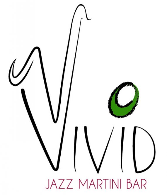
It is a saxophone, clearly. :)
Okay, now for a bit of brutal, not much, but a bit.
The olive. That outline stroke is a standard illustrator one isn't it? Try to avoid that entire stock brush library. But besides that, the outline doesn't fit with the rest of the logo. The olive would be better served with an outline that matches the symbol / letters. As it is now it is floating there, and it doesn't look connected to the rest.
I think the colours match together, so good job there.
I do like the fonts, I think the positioning needs to be tweaked. I keep thinking that the D and the Bar need to end parallel to each other.
The saxophone might need a bit of refining, especially near the top, its just a little rough. :)
It certainly is a good start though.
Thanks so much! Still working on the top of the sax, but have tweaked it a bit. Thanks, for the comment about the font, its hand rendered. Your feedback was great, so hard designing in a bubble. :-) Actually, I was wondering if you were thinking I should bow out the bottom of the "v" for a more rounded saxophon-y shape? As opposed to the sharp angle.
some further edits.
I like it better. The olive just pops now!
Remove the rings, as said below.
I think that the top of the sax needs refining. Make it as pointy as the bottom of the V and adjust the angle slightly so that they line up. :)
I like the idea and the olive-dot. The two rings at the end of the "V" are not necessary, they only complicate everything. Remember, all the letter are practically made of lines. Keep it simple. And another small advice: if you do make new versions, no matter how small the modifications, post-it as a new version of the first logo, not as a comment, it'll help you see the evolution
I think the idea is good, but you need to fine tune the execution. The latest edits are looking good.
Think about how it will work at small sizes. Small text and thin lines usually hard to reproduce on a napkin or on a business card.
I feel everything is too thin..
I'm really not feeling this.
Though the saxophone shaped V isn't a bad idea, the end result is working. The word mark looks like it's been done on the fly. It's too thin and overstretched. Keep it simple.
The olive doesn't really have a purpose there. You already have one symbol with saxophone, you don't need another. It only complicates things.