Brands of the World is the largest free library of downloadable vector logos, and a logo critique community. Search and download vector logos in AI, EPS, PDF, SVG, and CDR formats. If you have a logo that is not yet present in the library, we urge you to upload it. Thank you for your participation.
Version history
Version 1

- I
- S
- T
- C


16 Comments
On a can
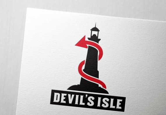
Looks good, I like it. I do not think you need the black box behind the type.
I love it. Great job. Let us know if you win =)
Much appreciated, will post back if I win :D
Very well done. I'd keep the black box, though. It looks like solid ground for the lighthouse.
More seriously, be careful of so-called logo "contests". More often than not, there are just scams consisting of making hundreds of designers work for free, promising them a few bucks. It's a win-win for the "client" who gets a lot of proposals for a minimal cost.
It's called spec work, and should be avoided and denounced. http://graphicdesign.about.com/od/career/f/what_is_spec.htm
I wasn't aware of this cancer before. Thanks for the information. That's a really cheap tactic.
Great design, and good luck to you! I would only add one thing: make the silhouette of the rock base deeper and wider, then integrate the text into it rather than have a separate box. You could even have some of the text pop up partly above the rock line on the ends.
Really good job here! Good luck in the competition! I completely agree with what Shawali has said about these so called contests though.. i used to enter them and its really hard to win because theres so many people competing, also the winners tend to be people who have won before so they start to build up a reputation of being good, therefor most of the time their logo will get picked. Its a win win for the client, they get a really cool logo for bugger all, something i dont agree with hence why i dont enter them any more
it looks really sharp!!
Oh, I love this. Wonderful job. I also like the black box under it, I think it adds something to the logo. What does the company do?
It's an ale, as per the title of the thread ;)
Ah, I didn't see that. Makes sense. :P
Looks good, what I would do is give a bit more space between "Devil's" and "Isle" so they can be more easily read and I would make the red tail end a bit bigger so the wrapping effect is more dramatic. Other than that fantastic job! Super professional!
Very good job, has its own style, really communicating what you want to represent.
It would certainly be a brand with much remembrance.
The only thing I can fault is be more careful with kerning especially in the word "devil".
Congratulations and good luck.
Beautiful