Aba Inc.
Brief from client
Logo for a MKT agency. Based in Cancun, where the client wanted to have somehow incorporated the name of the 3 owners and let the customers know that any of the 3 of them could perform the same target as the other one. Let them know that it didn't matter which one of them did the job, because it was all the same (in terms of productivy, responsability and creativity)

Since the beginning, the client made it clear what he wanted for his logo. As these were people who had knowledge of graphic design and had their own ideas, was a complex process.
We start from the point where they wanted to express that any of the 3 would carry out any work in the same way, ensuring clients that it didn't matter who they were speaking to, since the 3 of them would work the same. First a font which had to be manipulated to round edges, making allusion to the cycle that follows the process of creating.
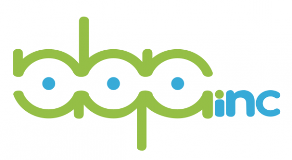
After the implementation of anagrams so that in whatever way they see the logo, the same thing would be seen (basically the principle on which they based their company). Regarding the use of the name of the 3, the first letter of the name of each one of them was use to build the anagrama.
On the right end of the logo we added the word INC denoting the end the corporation. Regarding colors, a turquoise was used as the company is located in Cancun contrast and color was green.


5 Comments
Good idea, but the end result doesn't really work.
It's barely readable. The font for "inc" is weird. The C is thinner than the N, for some reason. I also don't like the i which been reduced because you didn't want the dot to ba aligned with the 3 other ones.
The way you placed "inc" is defeating the purpose of the anagram. I also think that it's really superfluous, you don't need it, though you may not have a choice in the matter.
The colors makes me think of something having to do with kids. Not what I'd expect from an agency, even if it's located in Cancun. But maybe that's just me.
Good luck!
I agree with Shawali, although I don't think that the colors necessarily give connotations of kids and i'm on the fence about the inclusion of the 'inc' at the end.
I like the overall composition visually, but it fails on legibility. You couldn't get 'ABA' from looking at the logo. I had to cross reference the brief to find out what the letters were.
It's probably my mind and down to my individual Rorschach test, but it reminds me of three boobs.. maybe a subconscious Total Recall influence there? ;)
There, feel better? =)
GET YOUR ASS TO MARS!!!
Yeap this can't work. i don't know what says abainc? nqninc? aqainc? It's ok the owners want that but your need other ideas. The colors it's ok for the city, but you need stop and think that "all the logos in the city have this color pallet".
Good Luck and sorry for my bad english Suerte