Armorex
Brief from client
My own practice. My portfolio is full of feminine projects so I need to masculine it up some. This is a brand for lawn care products (leaf blowers, mowers, weed killer, etc). The feel of the brand should have a masculine edge and be sleek as well as modern-ish. Going with the idea of the "backyard warrior"....taking control of your domain, reign over your lawn, ideas like these.

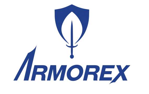
I'm looking at other brands like John Deer, Craftsman, and Black and Decker for research. I chose blue since this market is largely dominated by red and green. I'm worried that maybe that color choice loses the idea of a leaf within the logo? Does the logo feel too busy with three elements coming together? Is the sword/dagger a bit too thin and dainty compared to the shield thickness?


9 Comments
I actually saw a candle/flame here. But really, I don't have a problem with the symbol at all. It looks really neat.
The text is nice too, except I would watch your spacing between the E/X. The lower stroke is dangerously close to the E. Plus, its the only letter combination with a small amount of space.
Love it!
Oh, nice catch. Thanks, I'll address that. I'm still in the beginning stages of learning typography so something obvious like that slips by me at the moment! Do you think the green color would make you see the leaf rather than a flame?
Experimented some with the "e-x" relationship and also playing around with a more clear logo. Doesn't feel as innovative to me, but it does seem more straight forward. Stronger?
When I first looked at your logo, I didn't occur to me one moment it had something to do with landscaping tools. I thought it was just something to do with security.
This is a far better idea. Though the name doesn't really fit that type of business (it sounds like armored vehicle company) there's something happening with this symbol.
Make a new post for it to get a more in depth feedback.
Dagger maybe? I feel like the sword is almost too thin and makes the symbol look top heavy....maybe I've just looked at this too long and need to step away for a little while! haha
i don't get the link between your logo and landscaping...except if they use swords to cut grass? haha
anyways!! apart of that i'm not liking the colors, and the font you have used, the A doesnt match the rest of the text. (careful with the thickness of the A it isnt the same everywhere
Thanks for the feedback! At this point I've changed my mind and am working on another piece for this to post tomorrow. However, just to explain this first attempt some: The symbol is a combination of a shield, sword, and leaf shape. The company's tagline would be "For Backyard Warriors". It's a super hyped up aggressive route with some humor (after all, viewing your yard as a battle field and buying these tools to prepare for war is a pretty humorous comparison). So that is why the shield and sword are included. Also the A is just an enlarged section of the "m" of this font (with the added dagger blade swoop) so the two legs of the letter are meant to be different weights just as all of the angled legs are in this font. Also as I've read many times before a logo does not explain the company, it simply identifies it. A dentist logo does not have to have a tooth, a furniture store logo does not have to have a chair. The logo is simply something that is easily memorable, recognizable, and fits in with the rest of the brand identity as a whole. So, even if my logo were just a sword as long as it works as recognizable, memorable, and fits with the identity (this one I've posted does not accomplish this I know) then it doesn't matter if it is directly linked to lawn care. Think of Apple or Pepsi or Nike.
A lot of people defend a logo by using Nike/Pepsi/Apple as an example, but the difference is they are widely recognized brands. They've established their target audience and a connection between the brand and their products, so there's no confusion.
i don't get the link between your logo and landscaping...except if they use swords to cut grass? haha
anyways!! apart of that i'm not liking the colors, and the font you have used, the A doesnt match the rest of the text. (careful with the thickness of the A it isnt the same everywhere