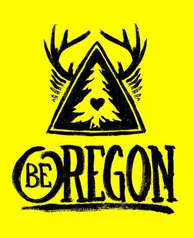
Be Oregon Logo,,,,
Brief from client
Create an Organic looking logo that would represent an outdoor clothing/lifestyle brand.

I am not a weathered logo designer by any means, but I enjoy taking up a new challenge. This design was created for my clothing line. I used oil paint on canvas paper. If you know much about paint, oil is a thick medium. Combined with the canvas paper I felt I would get the most organic look possible.
I know I could have created this in illustrator and made it far more symmetrical and added the distress later, but I thought that might look to forced and generic.
The lettering is obviously hand painted as well. I am definitely not a typographer (I respect the art form) but I think this works for what I was going for.
The symbol as a whole represents Oregon:
- Triangle for mountains
- Outer triangle for lakes (which you usually find surrounding mountains)
- The tree for how green we are
- Antlers for our wild life
- Heart for our love of the outdoors
- Feathers (loose representation under the antlers) for our state motto "She flies with her own wings"
As a designer I would love some feedback from other designers. I can do minor tweaks if needed, but overall the logo will have to be the same. But things I can think about the in the future when hand creating logos would be greatly appreciated!
I will be uploading a few more logos I am working and would love feedback and any suggestions.
Thanks ahead of time!


9 Comments
I must admit, I love this logo! You totally nailed the organic aspect.
Maybe I'd try to make the first o or "Oregon" consistent with the other characters and fine another place for "be".
But as a fan of hand lettering, you did a pretty good job!
Can't wait to see more logos from you!
I like this as well.
I know you don't want to make the logo feel forced, but I think a middle ground can be achieved here between distressed and vector-like. I don't think the line below "Oregon" is needed; in fact, I think it hinders. It makes the letters appear uneven, although I'm sure you did everything to make sure they were at least the same height (I wouldn't know for sure without manually measuring them myself, so this is an assumption). The only way to resolve this is to straighten the line, but removes from the organic, handmade aesthetic. I would simply remove it, as I don't believe it adds much anyway.
And I would try to make the triangle more straight. It's a geometric element by its own right, so I think you can get away with it.
Nice work.
I really like this, with one exception being the mirrored antlers. I respectfully disagree with Killswitch on tightening things up I believe the organic nature is important here, which is why the mirrored parts bother me. The hand drawn feel is well done and perfect for the subject, but the illusion is broken by the mirrored images of the antlers and embellishments. It disappoints me to see this as the rest is nicely done and wouldn't take much more time to create both sides individually.
The mirrored antlers is something I agree could be adjusted to break the mirrored look. I still think the triangle could be improved, though. It doesn't look handmade to me, it looks like it was purposely drawn imperfect. Triangles aren't that hard to draw evenly. No offense to the designer.
Good point about the mirrored antlers. It kills a bit the organic thing you're for.
Not to get on my soap box but more designers also need to create their own brushes for this sort of thing, especially in Illustrator. It's done well here, but too often you can spot the default chalk brush a mile away (literally, I just saw one used on a billboard graphic this morning)
I prefer using clipping masks and texture layers, myself.
Amen.
I'm really liking this, and i credit you for the process you went through to get to this.
I would get rid of the line under the text as its not adding anything, if anything its hindering your logo.
I'm curious to know how many times you painted this.. If i were you i would paint it over and over, that way you will develop a collection of the same logo where you can pick out one that looks the best.
Nice Job!