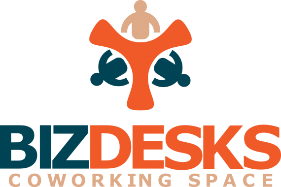
BIZDESKS
Yardman | Sun, 01/19/2020 - 06:51
Brief from client
BIZDESK is a coworking space that allows clients to focus on what’s really important and getting their work done while meeting and collaborating with other clients that will add value to their products and services.
Slogan: "Together we work"


2 Comments
Well I must say this is an improvement, although there is much room for improvement.
Right off the bat, the symbol made me think of the biohazard symbol for some reasons. I would simplify it further by removing those 3 little people. What's left of the symbol is very interesting on its own. And do not worry about not clearly having people behind desk. A logo shouldn't be as informative as it should leave a lasting impression.
The choice of font is nice, but you need to fix that tracking (the even distribution of space between character). Right now it's too squeezed in together.
The subtext isn't really working, especially with that colour that doesn't match the rest.
Thanks again for your insight. instead of the three little people, i had three small blue circles.