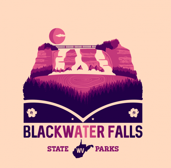
Blackwater Falls
ErinsSonicYouth | Sun, 12/03/2017 - 01:46
Brief from client
For those who haven't seen these before,
I've been doing a series on National and State parks, if you look through my pins you can see the others.
These are more fully realized designs rather than traditional logos, so please keep that in mind when critiquing. I'm not looking to simplify these down to 2 color/minimal logo status.


3 Comments
Nice work, really like the colour pallette & perspective. Things I would tweak are the the sun - remove the shadow & make the cloud puffier like the foam below - & the water ripples look a bit like wood grain. Maybe those could be more linear & radiating from the waterfall base.
Would love to see the whole set of these in one post but obviously this is not allowed on BOTW. You've created a wonderful set of consistently good logos with a tricky brief. Matt's comments above are really constructive and I'm sure they would improve an already great logo. It's also nice to see someone like Matt, who creates some really strong logos himself, giving constructive advice to others.
This one is pretty cool. Good colors, good layout!
I do agree the water lines could look more like they are flowing out from the waterfall.