DAL
Naksnaks | Fri, 08/10/2018 - 11:54
Brief from client
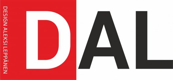
This is a logo I scetched for my own, very little desing agency.
I haven't studied design that much, I just try things until I like what I see.

I know you guys probably find tons of things wrong with these logos, but that's why I'm uploading them so I can correct my mistakes and make them better.
Any feedback is appreciated!
This is version one of the logo I had in mind. The "d" in the square can be used in situations where there's not that much space to use the whole logo.


1 Comments
This is the kind of logo that can only look good if it's part of much broader branding guidelines.
In and out of itself, there's not much to be excited about, it's borderline simplistic.
The D in the red rectangle messes with the kerning a bit. The vertical subtext is barely readable and will be even more so at a reduced size. As a rule of thumb, it's better to not have the subtext integral to your logo. When it's removed, the logo shouldn't look any different.