Fiber Fit
Brief from client
"We would like to see a modern logo that is masculine & somewhat abstract (we are open to any suggestions)."
"Our focus group is mainly young adults, male and female that want to have a better lifestyle, think about losing weight or building up a better endurance."
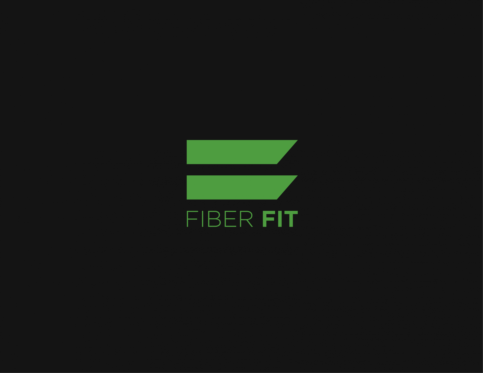
These are abstract muscle fibers growing. The icon englobes everything the client wants it to represent: Lifestyle improvement, Better endurance, having a healthier body and so on, all that from an abstract and modern perspective, which are also client requests for this logo.
People probably won't see musle fibers here, though, so I'm making sure the icon consists of straight horizontal lines, is bold and ends inclined, showing movement, effectiveness and all the other values that this logo needs to carry. The symbol is also kind of inspired by the letter F.
1 Comments
I like the abstract F inspiration! Font is good too.
For some reason my brain doesn't like the "fit" being bolder than the "fiber"..it feels...off balanced maybe? Not sure, maybe squish the words closer together or switch the word that's bolded? Just my two cents. Good job! :)