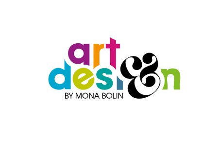
Freelancer´s/Artist logo
Mona Bolin | Sun, 08/05/2012 - 08:51
Brief from client
The most critical client I've ever had - myself ;)
I'm running a freelance studio and hence I've started working with larger companies and ad agencies, I feel I have to freshen up my own brand.
I have broad skills and work with branding, graphic & webdesign, illustration and packaging. My clients tend to hire me due to a helpful and cheerful personality, my attention to details and my willingness to always go the extra mile to deliver impeccable, fine adjusted work.
Woo, almost sounds like an ad fishing for work, however that is not my intention... just wanted to give a brief background about me and my work so you can assess the logo based on what the "company" is about.
Thanks in advance for your critique/comments.


9 Comments
I always think a logo should be made for different, common type of uses in order to see if it really works. So here is an overview for your assessment.
The idea is fine but something bothers my eyes when I see it. Perhaps is the combination of rounded forms with diagonals , or the number of colors. I would also play with a less decorative "&" symbol. Your work is fine but needs a little work on lines, try giving some dominant direction in the shapes (rounded or diagonals) in order to keep my eyes in the sockets :P.
Ha, ha... cheers! Valid points. Find it difficult to be truly objective and my own sober critique goggles seems to be out of focus when it's my own logo on the table.
I'll wait to see if any more constructive comments roll in before I figure out a way to attack the revision ;)
First things first- I like the colors for the most part, I think they're lively, excited and happy! BUT (there's just one small but) I would print a copy -or go to a print shop and have them printed professionally on a nice digital printer) to make sure that they all print as bright as you would like. Some people forget that when we see things on computer screens, there's light coming through the screen that allows the colors to be really bright, which isn't the case when something is on paper.
I like the logo as a whole, I think it's a really really good start but I don't think you have all that much farther to go! The one thing that pops right out at me is that if you can make the ampersand look a bit more like a G, that would be good. It's close right now, I get what you're going for- but I think you could modify it just a bit more to make it closer to a G it'd be great!
Also, it kinda irks me that we lose so much of the 'i' - but I'm not positive if that can be helped. Maybe once you work on the G the 'i' will present itself more!? Perhaps the white border/stroke area that you have around each letter doesn't have to be so wide!?
But really, overall I like this a lot. I think with a few tweaks here and there you'd have something great!
This is a great logo to me, it catches my eye instantly and invites me to contact you.
Nice work, Colors are great!
single colors are great too!
Powerful.
i really like it apart from to me the "&" is too overpowering. To me i think the words art/design should be the more overpowering feature. really like the flow of it though, perhaps a more creative name for your business as a freelancer would help as this name one is a bit simple.
Too much organic... in fact for some reason I see a snake ;) Your second version isn't that great either.
Heres what I think you should do... sketch 2-3 pages of thumbnail logo ideas. Really quick and off the top of your head. I know your a good designer... its hard doing shit for yourself. Took make ages to come up with what I have lol.
Awesome critique! Your snake rocks (lol)!
Yeah, got pretty stuck in the mud, so decided to take a breather. This one will to 99.9% certainty go in the bin.
Currently brainstorming a totally different concept... Changed my mindset and are trying to view "the brand" from the future looking back instead of what I am currently offering.
Thanks for taking your time, will check in when I'm back on track ;)
Cheerio!
First off, awesome! I think it is a great concept although there is only one thing I would not to adjust. since you have the G at an angle and also the e, it looks like a trick on the eyes. The G is definitely symbolic and can be used as an icon by itself. Beautifully designed! I also love that you can use it as one color or 2 color. So important when designing a logo.
I upload an image as I was referring to the e part of it.