Gateway Telecomunicaciones S.A. de C.V.
Brief from client
Gateway Telecomunicaciones
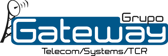
keep enterprise colors: red and/or blue, keep an identifying item like the tower, a microwave antenna and to give an international image or make emphasis in the Grupo (the relation it has with other companies).

keep enterprise colors: red and/or blue, keep an identifying item like the tower, a microwave antenna and to give an international image or make emphasis in the Grupo (the relation it has with other companies).
The image they had before was full of images, towers, antennas, a map, hexagons, a satellite and the words Grupo Gateway up from all the image.
I offered them a brand new and fresh image, changing all the items they used before just for words and an abstract image of a tower, i did this because they were asking me to mention all the business they do (telecom, systems, tcr) and it was almost impossible to include all they wanted in a simple logo that reflexed what they offer and the changes they're including in the company.


3 Comments
Well, There is a way to use all of these elements you have here in a logo and still have balance and decent proportion.
Get rid of that big blue thing first of all. If you need to use blue, use it for the text.
"Grupo Gateway" on one line with the tag beneath it.
I would use a different symbol, this looks a bit generic and like clip-art.
A letter mark or simple symbol will work. Look at your client's competitors for inspiration. You may need to explain that people don't have to know everything a company does just by looking at the logo. Check out any major corp.. Apple, Nike.. Do either of these symbols say computers or running? It's about recognition in the market place with a symbol that is pleasing to the viewer.
I don't know where to look first. The whole thing is too busy and yet monotonous
very useful comments, that's what i was expecting because other people don't dare to say a realistic opinion :)