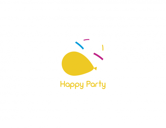
Happy Party
Gabriel Carvalh... | Wed, 10/31/2018 - 09:15
Brief from client
A party supply store.

Haven't changed much, but I have worked on other variations of this. Is the laughing face clearer now? Also, even if the face is not perceived (sometimes it is, other times it isn't, based on different feedback), are the colors... happier? I have blue and pink variations too.
Is anything wrong with this font, by the way?


5 Comments
I still probably wouldn't have seen the laughing face had you not pointed it out :( maybe make the eyes the same color and the eyebrows the same color, or make the face straight vertical instead of on an angle? Just suggestions, not sure if they'd make a positive difference.
I like the font though! And the colors are much happier.
Thanks. The separation of colors is probably going to help a lot. I'm concerned about organizing the party too much by doing that, but if it allows people to better identity the face, then I guess it's a sacrifice I'll have to make.
Needs a lot of work.
Can you be more specific?
To me it seems like you had the idea to make a balloon with a face but then skipped the sketching step and went straight to the computer. You are now too scared to mess up what you already have to scrap and start over with different concepts.
The elements are very disjointed. The text feels like an afterthought, not part of the design. The balloon sits at such an awkward angle to make the... mouth? Why not sketch some alternate layouts and then move forward with a different version? Here is what I quickly came up with as an alternate concept.