Hurl Page
Noobie37 | Sun, 03/29/2020 - 05:31
Brief from client
I am new to Logo Designing.
Out of 4 random words from word generator, I selected "Hurl Page" as it makes more sense.
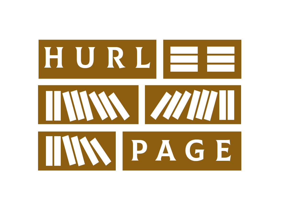
I assumed that "Hurl Page" is a wiki site and tried to come up with logo ideas out of which the following 3 has been finalized by me. This is the 1st logo.
Please let me know the mistakes and the improvements which I need to make.
Also, please tell me if I have used excessive objects in the logo.
Thank You
1 Comments
Sorry for the late feedback.
This is the most interesting of the 3. It's a good basis for a potential cool logo.
The stacked rectangles system is a good idea. It's all neat and tidy. But the randomly placed and tilted white rectangles clash with this system.
I'd spend a few more hours sketching out on paper to refine the idea.
Keep it up!