idear
Qneberg | Wed, 11/09/2011 - 00:03
Brief from client
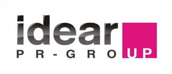
New concept logo for PR group «idear».

Earlier the idea of a logo consisted in use of words "idea" and mark "(R)", but it was too banal (In our language there is a word "idear" - it means clever).
Idear Is engaged in advertizing service.
New concept consists in it: "gro up" It is read as "grow up". "UP" grows from a white field upwards, And the empty place in a square shows that always there is a place for growth.


3 Comments
In graphic design world there is no such thing as 'too simple'. When I hear clients say 'this is too simple' my hair starts to jump in the air.
Best and most famous logos in the world are 'too simple'.
Now what we have here.... you obviously tried to turn a minimalistic simple & clean 'idea' word mark into something not so simple by adding cheap web 2.0 gloss effect defiling HelveticaBold in the process and made up some silly explanation about 'grow up' as an excuse to add a magenta square at the end with a negative 'up' to make it look "not so simple".
Well, you know what, you failed.
There is no idea here, no symbolism, and execution, although it might look web 2.0 trendy is poor and unimaginative.
This might as well be a logo for a carpet cleaning service certainly not for a PR agency that wants a modern and progressive look.
Back to the drawing board, sorry.
I really like the concept and type choices, but as a whole, breaking up the word "group" makes it a little hard to read at first glance.
I don't understand the idea. I don't like how the magenta breaks up the word. Overall confusing in my mind.