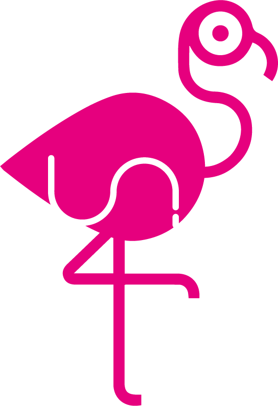
Logo for shopping app - Mark II
Brief from client
We are a start-up with a unique service that brings benefits to retailers as well as their consumers. We want our logo to communicate this fact,and be simple enough to use as an appicon. Our initial audience is younger women shopping at lean times on week days. We will be launching in a small country with a very cosmopoilitan, internet savvy population.
I have already got some feedback on one of our shortlisted options - https://www.brandsoftheworld.com/critique/logo-for-a-shopping-app-service. I'd much appreciate some feedback on this one.

This version of the logo uses a Flamingo ready to grab a fish out of the water. It is intended to signify the win-win nature of the service which helps retailers to identify prospective consumers with pin-point accuracy whilst at the same time allowing consumers to get just the right offers at the right time and the right place.
We have a blue version of this logo. Pink on its own would perhaps be a no-no color. We have considered it here since in the context of a flamingo it is not out of place. That apart it has a far higher CTA - both as an app icon and when seen as a sticker at the entrances of our retail partners.


2 Comments
In my opinion- your first version (the penguins) is a clear winner over this one. Not that this one is bad at all- but I really feel you were on to something with the penguins =)
I agree with j.o.y; the first version is much better.