Loom Design Co
Brief from client
Branding my own Graphic Design business.

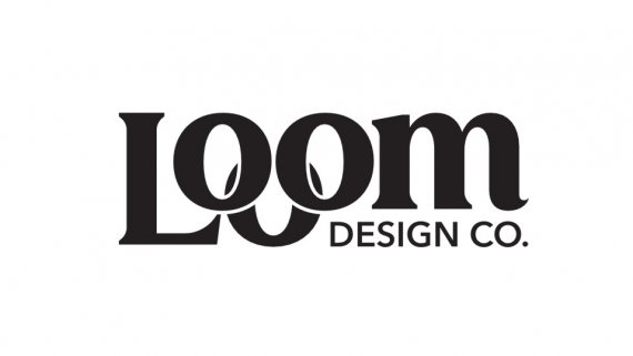
I have been a graphic designer for a little over 5 years. I work full time in design for a company, but am starting my own company to make some side money. My primary audience is small, local business with an emphasis on close personal relationships with my clients. I want them to feel as if Loom is an extension of their own business, that’s where the name comes from. I will primarily be doing branding, custom artwork, marketing and a little photography/ videography. I wanted a clean professional logo that’s also slightly playful. I wanted to display a sense of interconnection that represents my business mission. I’m having a hard time with the m and tag line. I feel like it works, but also kind of feel like it may look a little forced / unnecessary. Let me know what you think!
I am my toughest client to date as branding my own company has been extremely difficult. Thank you in advance for any feedback :)
PS I am planning on using color for my logo, just haven’t gotten to that stage yet. Want to lock in the design first before exploring color palettes.


2 Comments
I do think the third O is a little contrived. If the name Loom is supposed to suggest being woven into your client relationship, I don't think this does it. What other ideas did you have or are you stuck in this direction. Perhaps do a spitball of ten totally different ideas then see which one best represents the connectivity you are trying to convey.
Thanks for the feedback! While this is preliminary, i sketched out a few ideas and chose this one from the bunch and refined it. I am somewhat stuck on this general idea, again this is just preliminary. I appreciate the feedback, just trying to figure out if im pushing a dead end or heading in the right direction