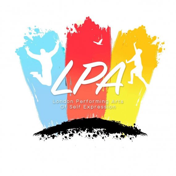
LPA
Brief from client
So i had this logo designed for me over a year ago for my performing arts academy LPA.
I would love to get people's feedback please if it is good or needs a rethink and another design. Does this bring out truly what the academy is about.
It's about performers being free to express themselves and reaching their creative potential in life..

LPA is a performing arts academy for performers
in the performing arts industry who want to connect to their power from within and reach their creative potential in life.
As a performer we tend to sometimes loose that connection to our divine being and we end up frustrated and stressed that we are not reaching our true creative powers.
We feel that we are being ignored and not being given roles or gigs to show and express our potential as that creative being that we are in this industry and put on this earth to do.
Whether you are an actor, singer, musician or dancer, a large percentage give up and end up taking the easy path in life and changing to a career that they hate cause it’s more comfortable for them. But not very fulfilling at the end of the day.
Through being part of our academy we feel that you will be able to become that true creative being by creating your own work, rather than waiting for work to come your way.
Our mission is to give the world of performers freedom to live and to discover their full potential.
We believe people will gain inspiration and be able to connect with that creative force that they were born to give to the world.


4 Comments
Hi Nice and colorful design! I was thinking the small text at the bottom is not really needed on the logo mark. That is really the "slogan" or information you would put on a business card, letterhead or an advertisement. The clue is looking at it posted on the BotW site for critique - you can barely see it. Using the shadow is also an attempt to try to get it to read on the color at bottom. Can it be larger below the black splatter to read better - and possibly still connected? In reality - the acronym would be LPASE? Just some initial thoughts!
Overall, I find this logo could be drastically simplified. There is just too much going on.
I'd remove the silhouettes, the subtext (which is almost unreadable and got that terrible drop shadow) and that black thing at the bottom.
Remember that a logo shouldn't be as informative as it should be memorable.
Basically, I think this logo would look a 100% better with just the brand name is bright white against that 3 colours background.
This is too much for a logo, maybe just playing with the PLA and the 3 vectors in the background you could acomplish something better, and cleaner.
Encourage backlinks by sharing your content on social media, gaming forums, or the https://sprunkedgame.org community to increase its authority.