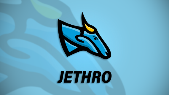
Mascot logo for a cell phone company
Brief from client
Clients brief:
We are a cell phone service provider in the US and are looking for mascot designs. The website for the company is www.jethromobile.com This mascot can be anything, such as animals, objects, even a robot. Some example includes Frog, Dog, Turtle, etc. The Value Proposition of the cell phone service that we provide includes the following -Reliable/Feel Safe -Trust Brand -Fast Speed/Wide coverage -Freedom of choice

Before I start talking about the design, This is my first mascot design (for a job), I made some designs to train when I was taking the courses but now let's just about this design, shall we?.
I chose this animal (buffalo) because I've heard that it represent trust, strength and energy, And the blue/yellow colours because blue represents trust, and it's commonly used for tech stuff and the yellow for energy.
I'm still new to Mascot designs, so I just want to know weather it's looking good and professional or not.
I didn't focus on the text, It is just to illustrate where the text can go, But as I understood from the client he only needs the mascot.
And BTW, the background is just for the presenting but when I'll give it to the client I'm for sure gonna remove it.
Thanks for the help...


2 Comments
really like the mascot but the mascot and the text feel like 2 completely separate things. you need to make the text look more in keeping with the mascot
Gotta say that I love the style of your work. The heavy outlines, the smart colors. Just as an FYI this a not a buffalo. Looks like a goat. Maybe a very young water buffalo. "trust, strength and energy" is associated with the American buffalo, the Bison. Which looks much more round and less goat like in appearance. Their horns are very different too.
You mentioned yourself that the font is not associated with this design, so all I can do is agree with that by reinforcing that it is wrong. As a suggestion, I would look to their competition to see what they do for the fonts for their logos. Then, that might give you a ballpark to start from. Serif vs sans serif, weight, feeling, and energy. Then you could start from some amalgamation of them and see how it feels. Next step would be taking that and morphing it to meet the styling of your icon. Then you'll have an entire package. Keep it up! You're on a good path here.