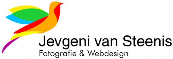
My own logo version 1
jevgenivansteenis | Mon, 04/07/2014 - 09:57
Brief from client
My name is Jevgeni. I am a dutch mediavormgever. Mediavormgever means mediadesigner.
I have to make a logo for my own company, it is a school project. My own company is specialized in making websites and doing professional photography.

About the logo
First line of text
That is my full name.
Second line of text
The work I do, Fotografie means Photography.
About the bird. I think a bird is a symbol for freedom. I love freedom while I am doning my job. I want to be free and make my own decisions while doing photography or while making a website. So that is why I chose the bird as a logo.


7 Comments
Looking Good
mooi kleurgebruik en symbool alleen de typografie misschien wat saai XD
Stick to English guys, so everybody can enjoy the conversation.
This logo looks too flimsy and unfinished. The font choice is poor and the kerning is way off.
Also, the composition is pretty bad. It's all happening on the left while there's nothing on the right to counter balance.
Thanks for you feedback.
I like the colors.
Maybe try to make your logo look smaller by 'entering' your name in 2 sentences.
Jevgeni
van Steenis
That way the balance problem could be fixed.
it is indeed a fine sketch but it needs a bit more work, the symbols color shapes looks to random and the whole thing is indeed a bit out of balance. but it got potentials!
Veel succes nog!
Thank you very much Webhunter!!