Otero filmmaker and photographer
Oteropf | Thu, 11/13/2014 - 14:13
Brief from client
For a freelance filmmaker and photographer. This one is a re-edition, trying to use a identificable logo with the client

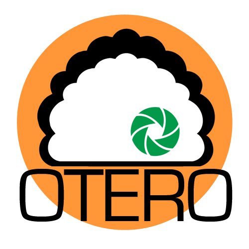
First at all, the main part of the logo, is the 'head', a curly head that has a similarity with the client. The diaphragm is the most important element because it has the explication of the company, being the 'eye' in the head. Colours, green for the eye and orange for the circle (a creative colour) I think both colours fits good in the full composition.
The typography is a Eurostile font.
Any advise, critique... are welcome!! Thanks a million!


8 Comments
Sorry, this doesn't work for me. You seem to have several ideas bundled into one package, but the pieces are visually clashing. The aperture symbol is randomly placed, the orange circle does nothing to contribute, the typography is far too big, and the cloud shape tells me nothing about your company. The only relevant piece of imagery here is the aperture icon.
I'd have to say it's back to the drawing board here. Good luck.
This look way too much like a logo for a sushi restaurant. I had to read the brief part to realize it's for a photographer.
And the aperture thing is like the CMYK idea for a print house: it's been done a gazillion times before.
Globally, you totally missed the mark here. Scrap this logo, do a bit of research and sketch a few dozen ideas.
Good luck!
Agreed on the generic aperture icon being generic.
In fact, I'm issuing you a challenge as a designer, Oteropf. See if you can make an awesome photography logo without an aperture or a camera in the logo. Set yourself apart from the rest a bit.
Ain't nobody got time for that :D But would be nice if the OP came through.
No. You have these seemingly unrelated items all thrown together. Each has meaning to YOU as an insider, but no to a consumer.
And frankly, it just doesn't work organically anyway. I would not know he is a photographer. It looks like a cloud-based product (not a persons head), and then there's an aperture in the middle. Could be anything. But it's not an "eye".
So it's really time to start over. Feel free to look at the design I created for Sarah Couzens, who is a photographer. I turned her initials into a camera. Simple. Telegraphic. Organic.
Too much going on.
Good idea.......but....from0 to2 the colors.......,no it's no good!
no, start design all over