Plastilang Logo
langandres33@gm... | Tue, 11/22/2011 - 04:07
Brief from client
Plastilang is a company that extrudes plastics profiles. The client wants:
1. Simple and easy to remember.
2. The name of the company always be explicit.
3. The logo transmit solid trajectory.
4. Some element that represent a plastic extrusion profile.
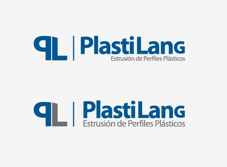
I have problems with the point 4. I think that the letters "PL" can be the element that represent what a extrusion is, but I dont want to do something in 3D to demostrate the extrusion.....
What do you think? Suggestions?
Here is a pick for those who dont know what a plastic extrusion is:
http://www.specialserviceplastic.com/images/products2.jpg
Thanks for your reviews!!
8 Comments
The logo and text are easy to read. The two color (or shades) look better than one color. I agree with your problem on point 4, but it is a product specific company and all its clients know what extrusion is. If you don't want to go 3D, then this works for me. I get it.
Yes! What my client also need is that the clients that dont know what extrusion is, whith the logo can understand a little...
Thanks for your point!!!
Good works. But the article needs to work a little better readability. I can work on the trailing letter.
I like the typography and font choice, and I agree with 2423Media that the 2 colour option is much better. I'm just not sure I like the PL icon, especially the curved shape you've given to the top. Looking at the image you've supplied, I noticed that a few of the plastic moulds have letter-like shapes to the ends. Why not try copying that style of shape (one that the clients' customers will be very familiar with) to create the P and L of the icon?
In addition to what is said above.. I don't think throwing a capital "G" at the end works. It is very distracting. I like the font. Just that one element is a problem. I'm sort of surprised nobody else mentioned it.
I think the first one works. The tagline is a bit too close to the logotype.
Logo would work if there was not a really big flaw with that last capital 'G'.
I know you wanted clear space below so you can fit your tagline but you just failed to execute main logo text properly.
If you look closer you will see that 'G' is significantly thinner then the rest of the letters. Fix this and logo will work. I would suggest you use lowercase 'g' and move your tagline to the left side (make tagline smaller so it gets some space between it and the main logo text, it's too crowded now).
Thanks for your opinion! Helpfull!