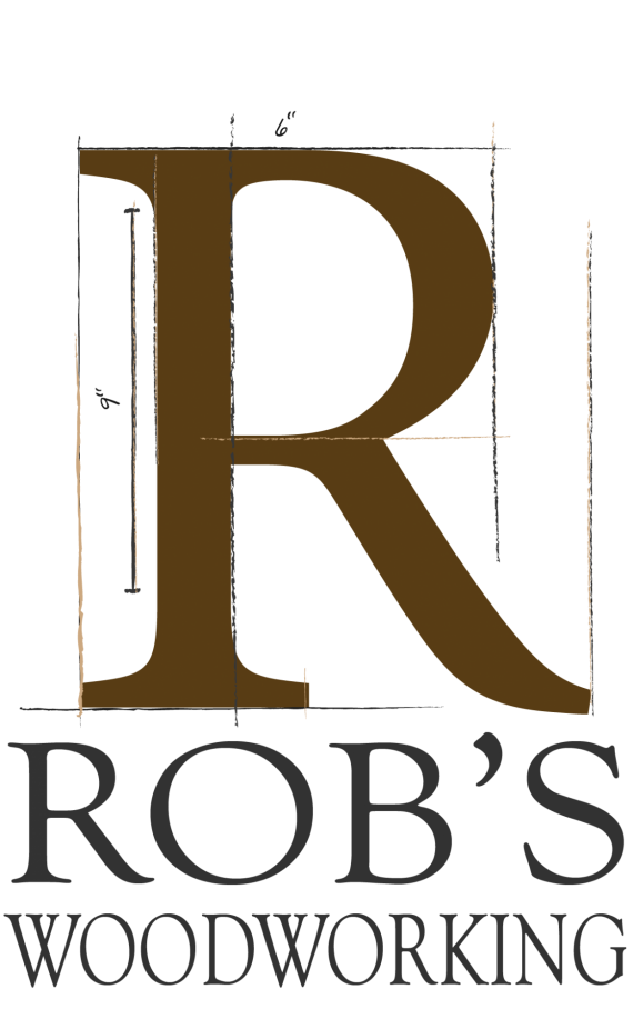
Rob's Woodworking
derusa74@gmail.com | Tue, 02/27/2018 - 20:15
Brief from client
looking to surprise my dad with a logo he can use in his workshop and on business cards as a thank you for all the stuff he's built me. I know he's old school and loves to be precise with his measurements as well as it being a long-time hobby.
Take a look and let me know how I can make this better.
Things we'll use it for:
-A big sign in his workshop
-mugs
-business cards


3 Comments
I like the "sketchy", measurement theme especially if your Pops is precise about things like this.
My main problem is the Font. I actually like the font, but not for this application.
1. What's odd is that it looks nothing like the Rolls Royce R, but for some reason that's the first thing I thought of when I saw it.
2. It looks like you are using a version of Trajan or Trajan Pro? Great font,
and I could be wrong, it looks like you stretched the Rob's part and artificially condensed the Woodworking part. I would avoid this as it distorts the true proportions of the letters. Again - could be wrong.
Woodworking needs work on kerning.
I like the colors, and the variations of the browns, I'm just wondering does this accurately reflect how he would sketch something? Meaning would it look more authentic with shades of grey?
If you just want the colors to have color and not greys then go with it!
I think you can find a font that is a bit less fancy looking on the R and I would definitely keep the serif font choice. Good idea!
This was absolutely helpful. I appreciate your time and I'll be working on updating again, soon. Bakersville is going to be jam; good call!
Some Ideas
- Baskerville
- Caslon
- Hoefler Text