SEM 4
buzzroberts | Sun, 04/19/2015 - 17:41
Brief from client
Needs to look simple, clean, professional.
Needs to work on websites, in visual media (lower thirds and banners), and in print (letterheads).
Their eye can be reworked or continued to be used.

SEM is redoing their logo and asked me to take a crack at it. I have 5 versions/variations for consideration.
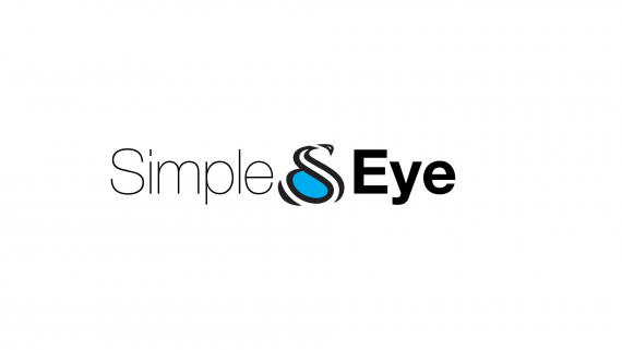
I this one I created a new eye that has elements of an S. Then I took some very simple looking fonts of the words and roughed it in.
I like the way the E and Y play together to create a "nose" sort of a profile of a face there.


2 Comments
OK
No, this is not working. The person above me has all the thumbs backwards. The only passable thing is the Typography. Even then it is just alright. It is just a pass, it could be far better.
What is that symbol? It looks like a snake cuddling a blue rock. It doesn't look like an eye or remind me of an eye of any kind.
Pure cyan? Really? That is even worse than using just a colour from the default palette.
I think you need to scrap all of your ideas and start from scratch. Research, sketch, sketch, refine, sketch, refine, refine, refine, and then come back with your designs.