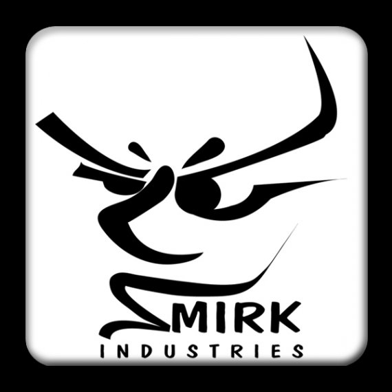
Smirk Industries - Circa 2010
Carlo_5 | Thu, 01/11/2018 - 22:18
Brief from client
Incorporate abstract face into logo for Smirk Industries a T-Shirt company.
Based on Graphic Tees and Skater type clothing.

It was hand sketched then traced in illustrator w/ pen tool. Not a fan of the font at all
Wow, this is a super old logo I did. Anyway, the company like 10,000 other guys' ideas to get rich off selling "their" unique tees never even got off the ground, unfortunately. He did have some cool ideas.
I got paid though.


2 Comments
I really like this. In the thumbnail version I saw two people dancing, then I saw the name and realized it was a face. In many ways it has a strong Asian feel to it, perhaps that was what they rejected. You are right, the font is meh. I would be interested in seeing what branding they did choose.
Hi - thanks for the feedback. Yeah I dug this on up off an old flash drive. Totally has an Asian feel I agree. The logo was actually not rejected. The guy loved it but never could get his business off the ground.
Actually there’s a lesson there to all freelancers make sure final payment is delivered at time of logo delivery if it is not an established business.
Font sucks - I don’t remember why it was selected.
It would be fun to try and rework it years later if I can find the AI 7 file!