Terra-Female Clothing (feedback)
joaooliva1994 | Fri, 04/01/2016 - 20:36
Brief from client
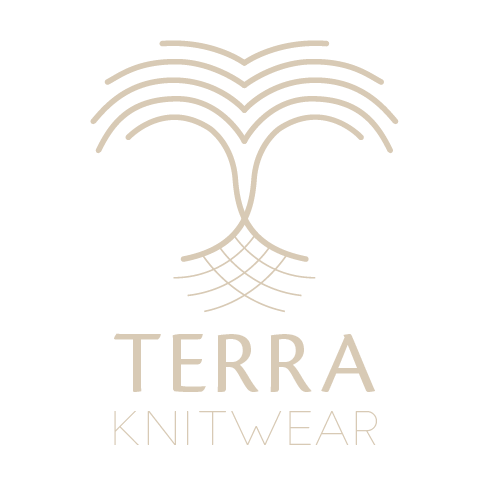
The client is a brand of female knitwear, they want a logo that represents their values of something feminine, natural and never forgetting the "roots" of the brand and their country (Portugal).

I represented a tree here, as a symbol of something natural, but with smooth lines, nothing too aggressive, to keep the "feminine touch". In the bottom, in a thinner line, are the roots, that "connect" the brand to their origins, and at the same time, is represented the knit pattern.
I have some doublts on the color and if I made the right choices about the typography. Any feedback would be helpful.


2 Comments
I like the idea here and I do see the tree as well as a feminine figure but I rated the symbol down because it still needs some work. The curves in the middle could be smoothed out more and the spacing between the end of the lines at the top are a bit uneven, most notably on the inner most curves on both sides. I rated the typography and color down because, while I don't have a problem with the main font, KNITWEAR practically disappears due to the light font weight and light color. Not a bad start and I hope this helps.
The symbol looks just more like ornamentations rather than a solid, evocative mark.
I like the choice of font and shade.
But unfortunately, there's not much happening with this logo. Maybe if you'd put that symbol in a frame, it could give it more weight.
Keep it up!