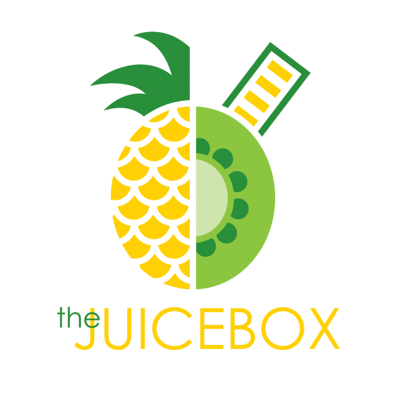
The Juicebox
jukesie | Mon, 10/24/2016 - 12:50
Brief from client
Client required a logo for a new juice / health food bar specializing in smoothies and fruit juice drinks. They wanted it to convey a sense of lightness and happiness.

I really like how this logo has come out, and although I'm not overall fussed about the typeface the actual visual logo has come out nicely. I was just wondering if there was something extra I could add/tweak to bump this logo into a higher level of aesthetics. Please be constructive.
Thanks for your time.


3 Comments
Not really liking the symbol. In my estimation, it would be more appealing to take an obviously round fruit and make it square or rectangular then put a straw where the stem would go. This split kiwi/pineapple doesn't really work for me.
Thank you for your view, it's given me some nice thoughts. I'll see what I can sort.
I would consider relocating "the" It is a bit bothersome being placed over the J, when it could just as easily be placed beside it.